
Publication design for Pennsylvania Partnership for Children. This 200+ page document examines the state of child well-being in the state of Pennsylvania. Graphs and maps indicated trends and conditions of health, social and economic conditions, educational, safety and family issues, geographic and demographic influences.
Maps and charts gave information on a county by county basis on the following child health well-being:
- low birth weights
- prenatal care
- births to single teens
- infant mortality
- child and youth death rates
- child welfare placements
- school dropout rates
- children in poverty
- children in single-parent homes
- overall composite ranking
Data was given as Excel information then converted to Adobe Illustrator. This allowed for preparation of the printing process and a 3 flat color reproduction. Cost savings through printing was done through a 6‑color Heidelberg press. Sheets were run through the first ink rollers then turned 180 degrees after the third roller to complete the run. Pre-production was also done within the studio. Spiral binding was done allowing State Congress members (their request) to lay flat on table tops while referencing specific information.
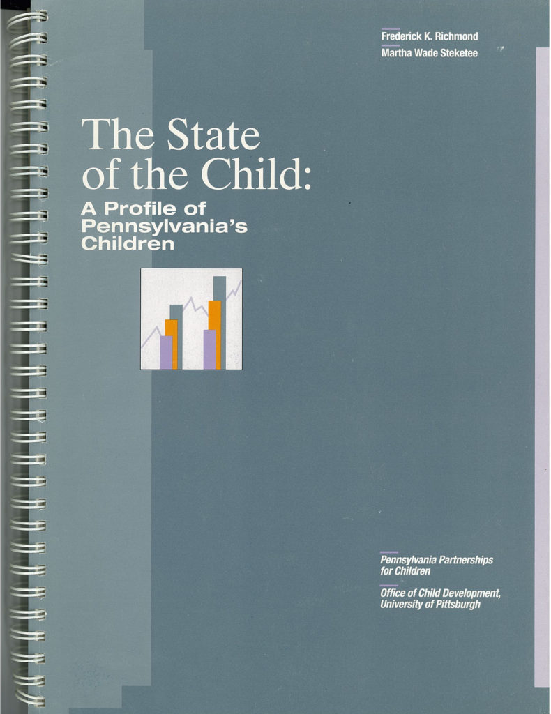
Cover design for first edition
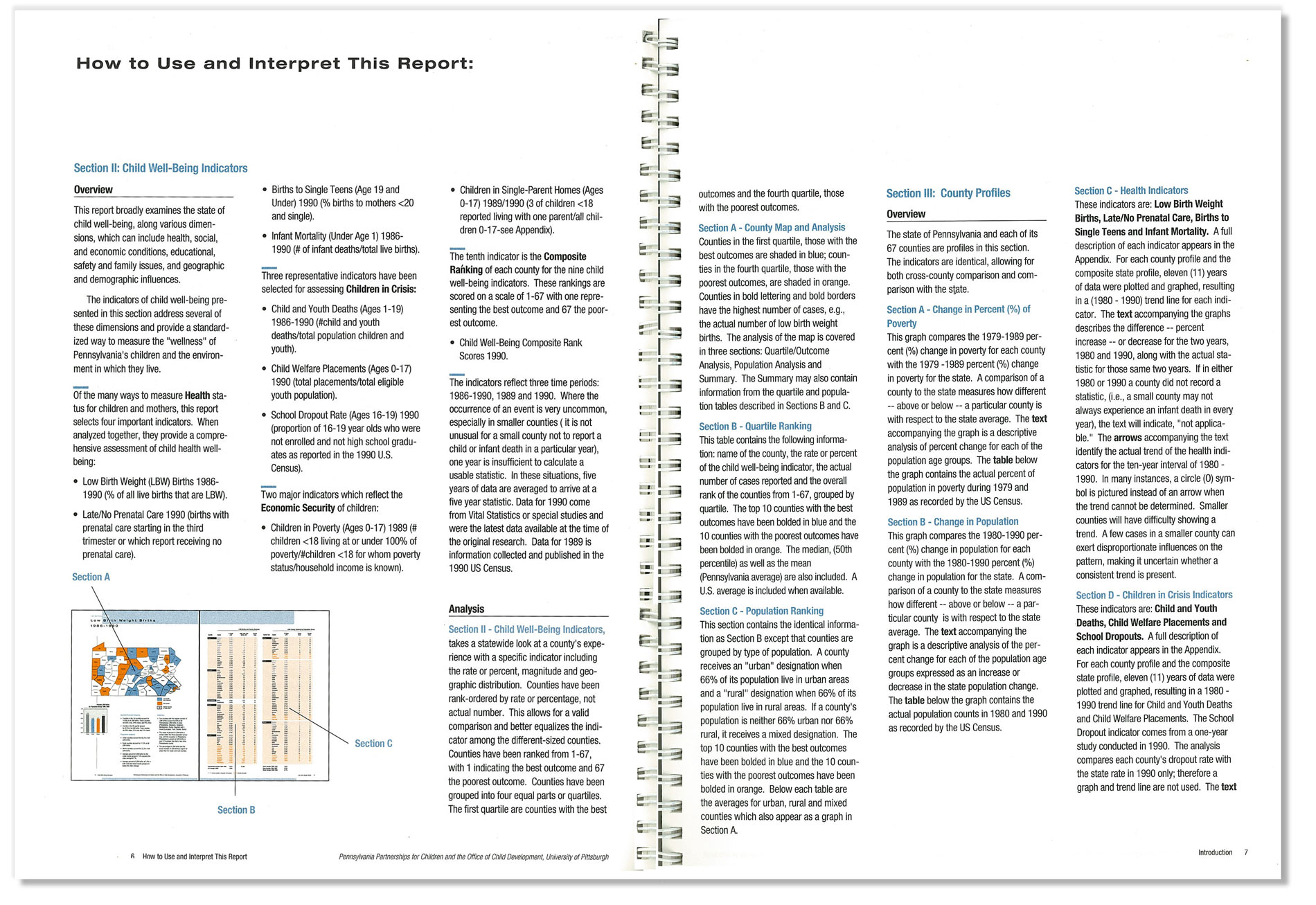
Opening typographic spread explaining graphics, statistics and indicators.
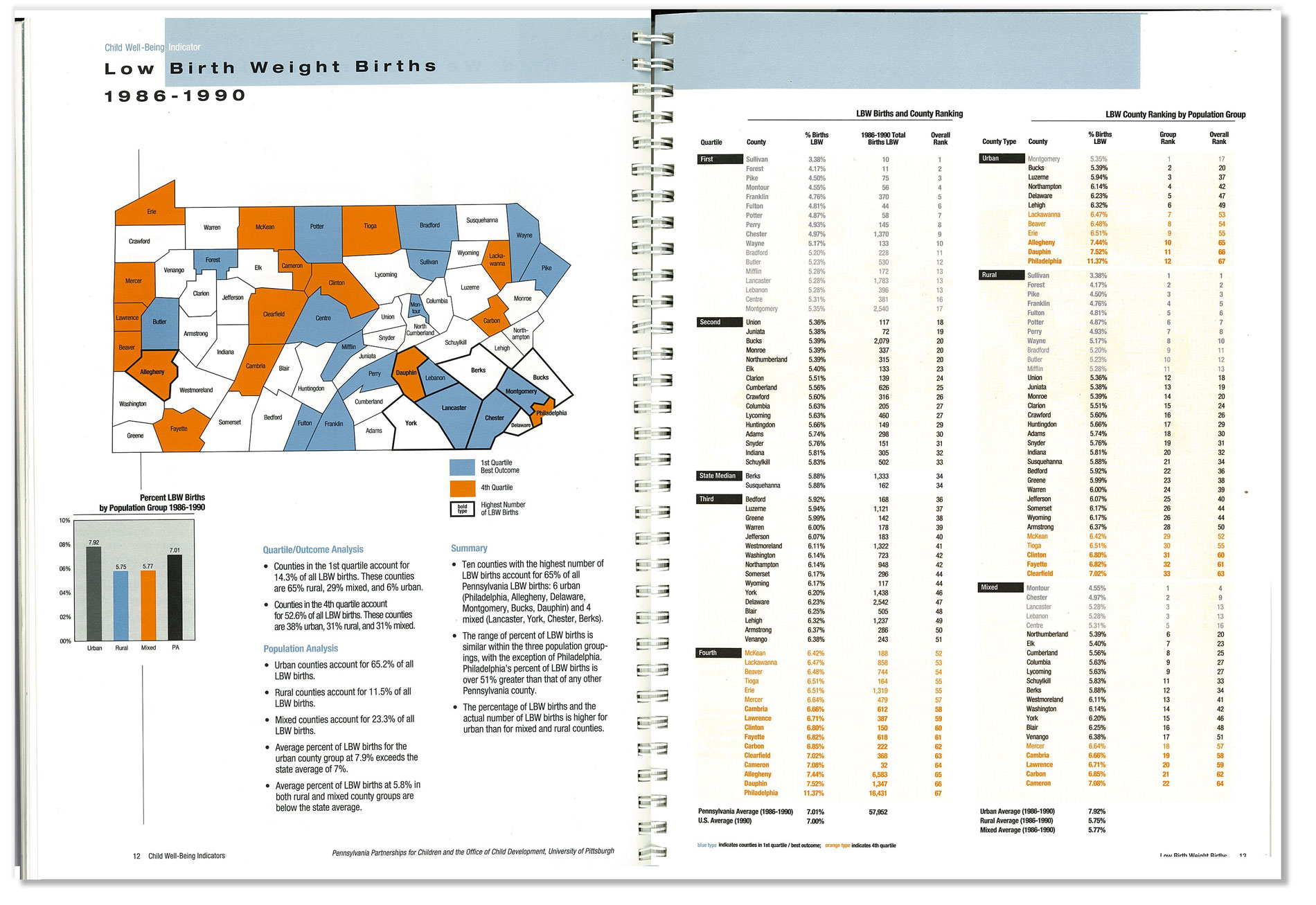
Pennsylvania map spread. Map is broken into counties and demonstrates which counties statistically have better (blue) or worst (orange) percentiles of low birth rate instances. The accompanying tables demonstrate county rankings and comparisons throught PA.
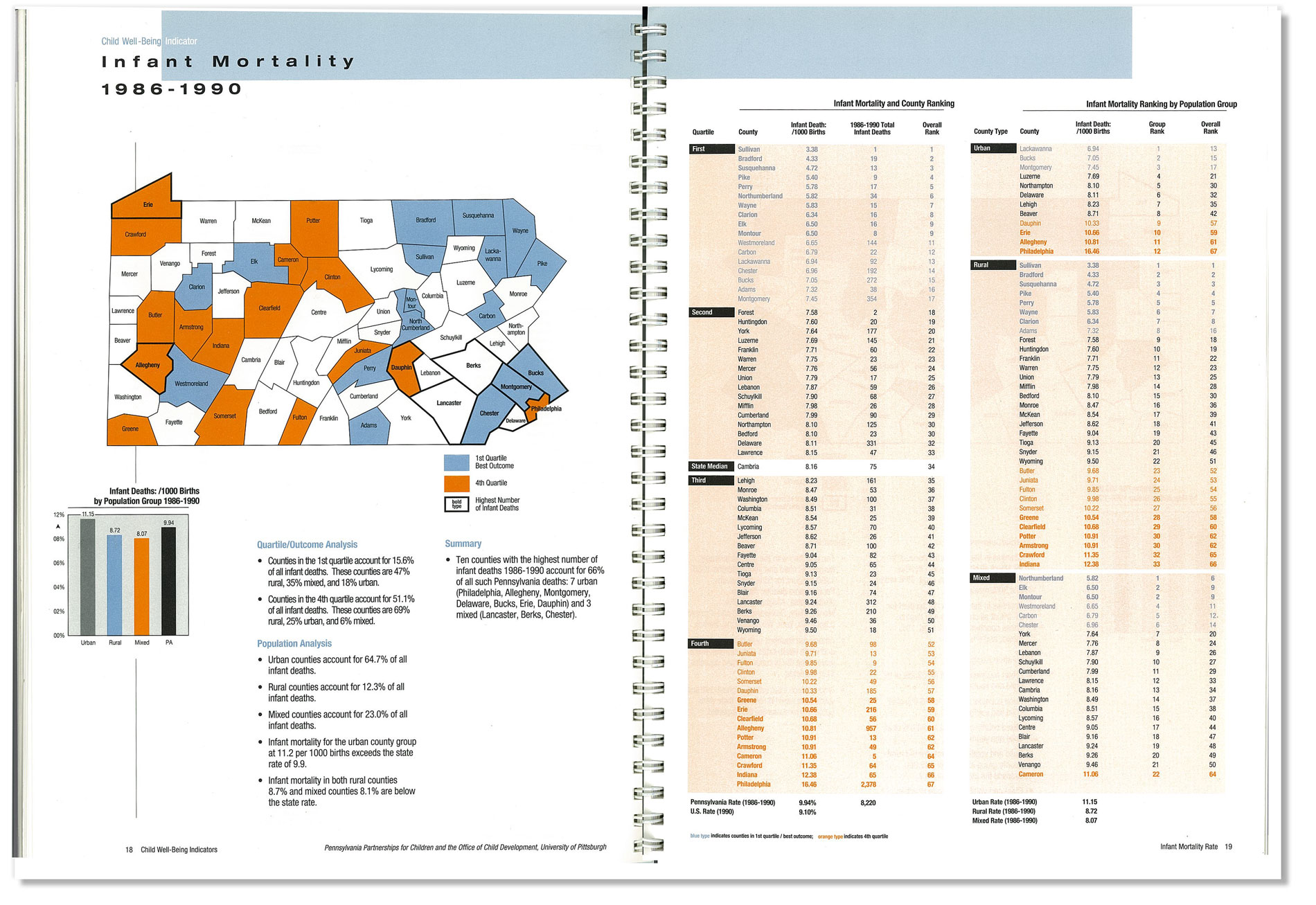
Pennsylvania map spread. Map is broken into counties and demonstrates which counties statistically have better (blue) or worst (orange) percentiles of infant mortality. The accompanying tables demonstrate county rankings and comparisons throught PA.

Graph spreads are broken down by each county and its comparison of indicators to the state level. Graphics also demonstrate upward and downward trends of poverty and health indicators.
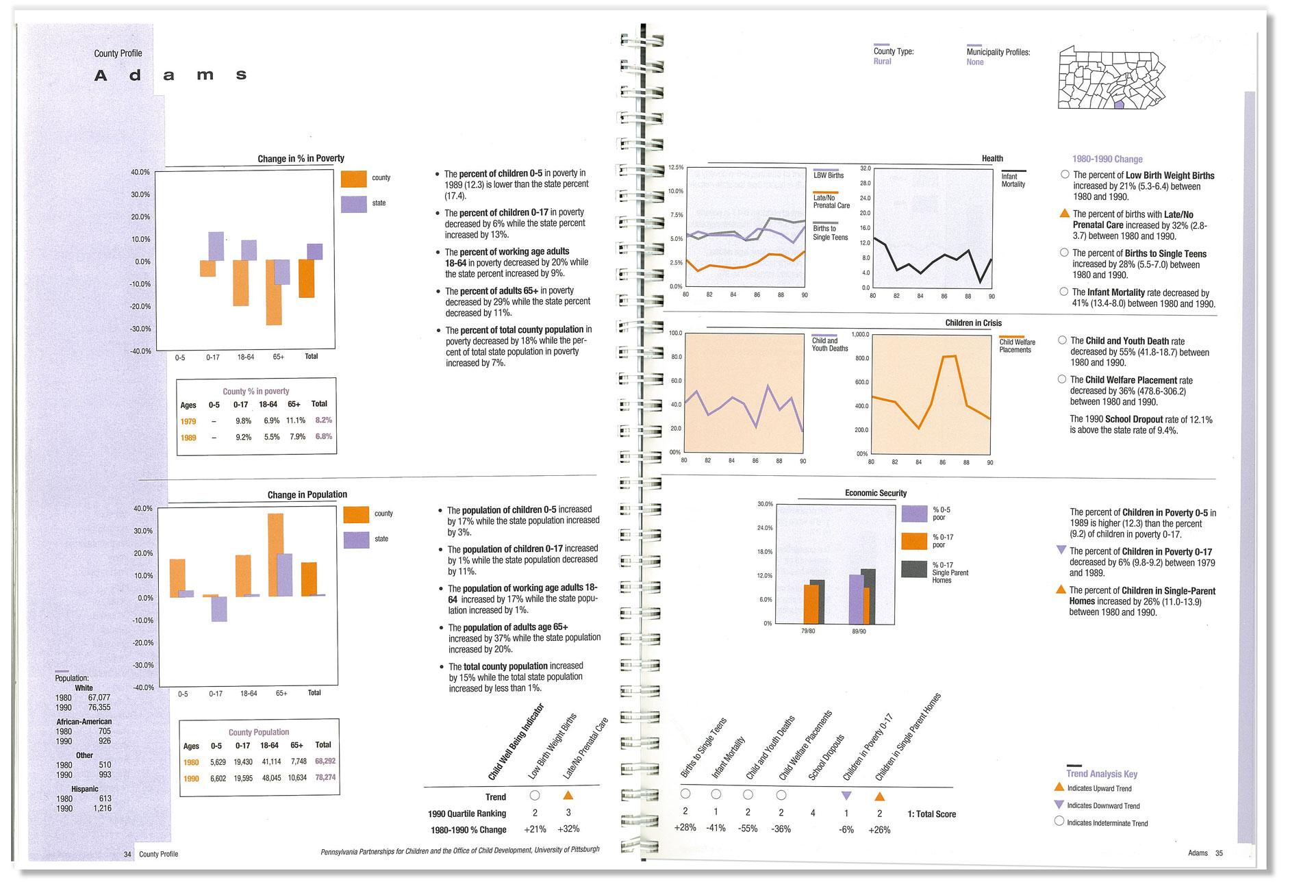
Graph spreads are broken down by each county and its comparison of indicators to the state level. Graphics also demonstrate upward and downward trends of poverty and health indicators.
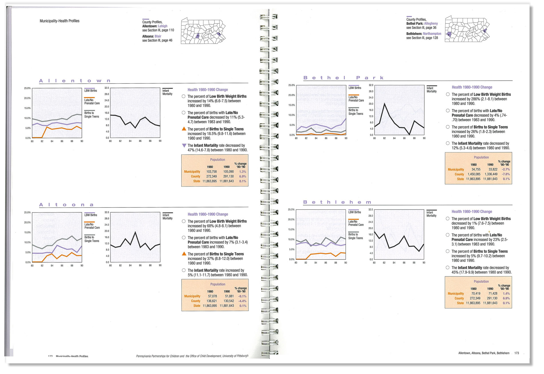
Graph spreads are broken down by each county and its comparison of indicators to the state level. Graphics also demonstrate upward and downward trends of poverty and health indicators.