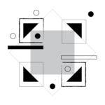
The following is research investigating the use of CSS animation for digital clock designs. During my recent graduate studies, I had been thinking back to my first experience as an undergraduate graphic design student in Philadelphia. My first-year design class began with black and white compositions composed of simple dot arrangements. I eventually learned that these ‘simple’ arrangements had layers of complexity and thought behind them that would later help me do more sophisticated work. These early exercises taught my class and I about aspects of composition, aesthetic principles, and the relationships between individual compositions in a series and as the individual composition itself. As a graphic design teacher, I have applied these exercises to first semester graphic design students.
Movement inspired by the motion of bicycle wheels.
A clock beginning with primary colors. As the sections of the clocks rotate, the three primary colors mix together and form this array of additional colors
For my own research, I did not want to go so far back in my work (although maybe it is not a bad idea to revisit these elementary moments within one’s profession now and then). I thought of applying them to something else. I had thought of a project done by a former professor years ago before the advent of computers and software. Students were designing analogue clocks for a variety of themes. Initial exercises were about reducing elements of a clock and discovering what is essential in our experience of marking time. By redefining clock elements and digit references and combined with our own experiences in ‘reading’ clocks, there opens up a multitude of design possibilities in creating one’s own clock.

A design investigation began with looking at basic structures of clocks. What happens when the usual elements of an analog clock are replaced with simple, but unexpected elements
I applied this concept with the use of HTML, CSS, and a little Javascript (used to have the clock tell the actual time) we can see how these designs act within
kinetic movements of what we know about clocks and our own understanding of time. How do these designs change when there is movement?
Questions and thoughts while designing:
- what is needed to show a clock?
- what is needed to demonstrate time?
- are numbers always so critical? (perhaps at a train station).
- are all the numbers critical? just some? just one?
- can abstract representations of clocks function in environments where it is not as critical to know the exact time?
- how much does movement affect the presentation
of a concept?
Clock design with simple elements. A graphic crescent moon shape acts as a second hand. We normally look at the second hand as a minor element when reading time, but here the animation of the moon-shape carries more visual weight. The shape also speaks to the celestial object’s history of reading time before we ever had modern day clocks.
Clock design with simple elements. Here, I show my hand from the above animation. The second hand is its own element with a bit more hierarchy than the the other two hands. The previous moon shape is no longer evident, but the large rotating circle tells a viewer about the ceaseless march of time.