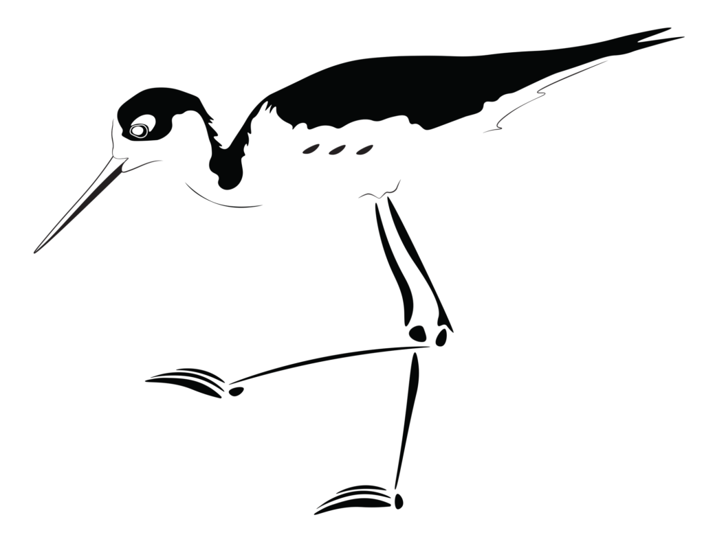
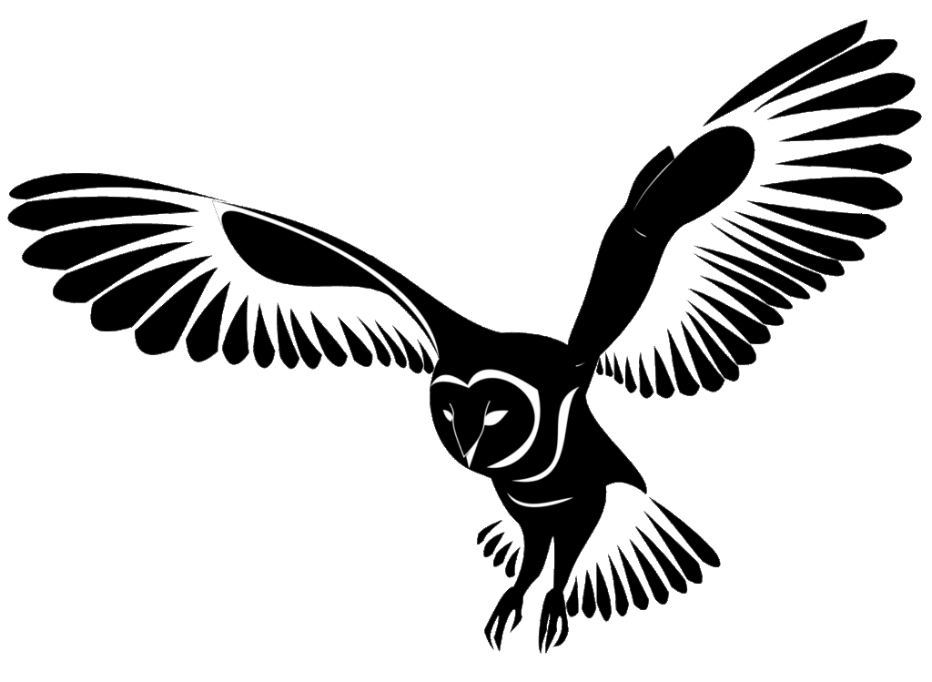
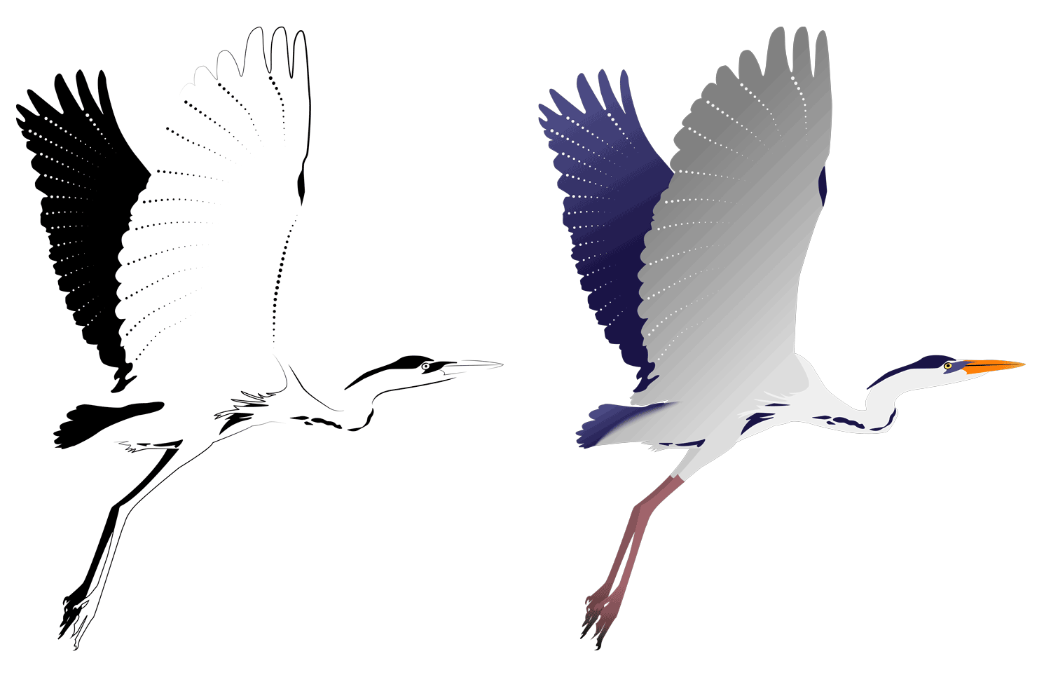
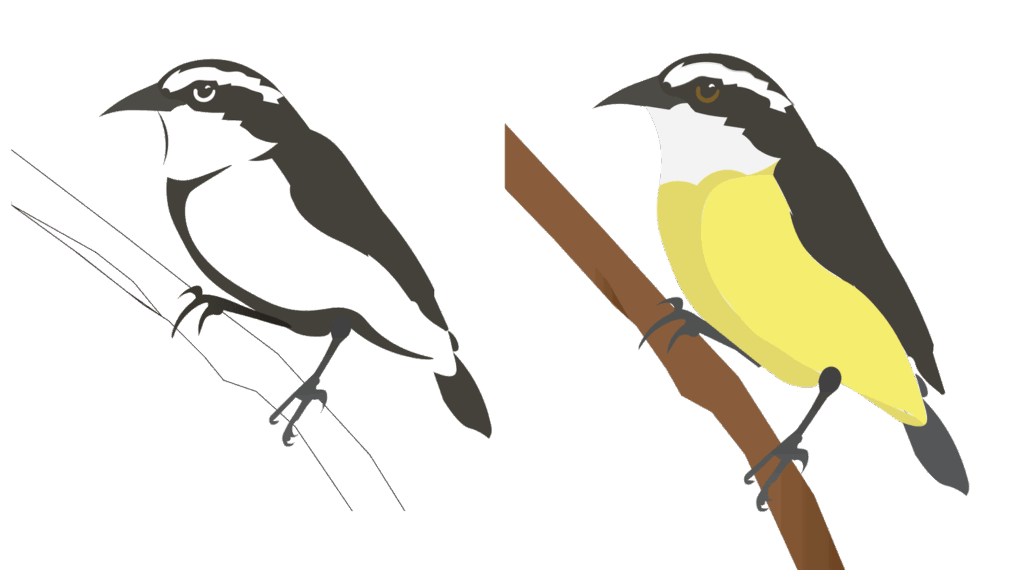
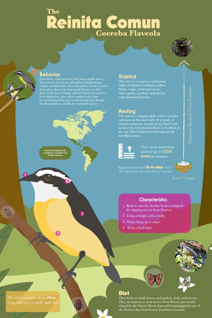
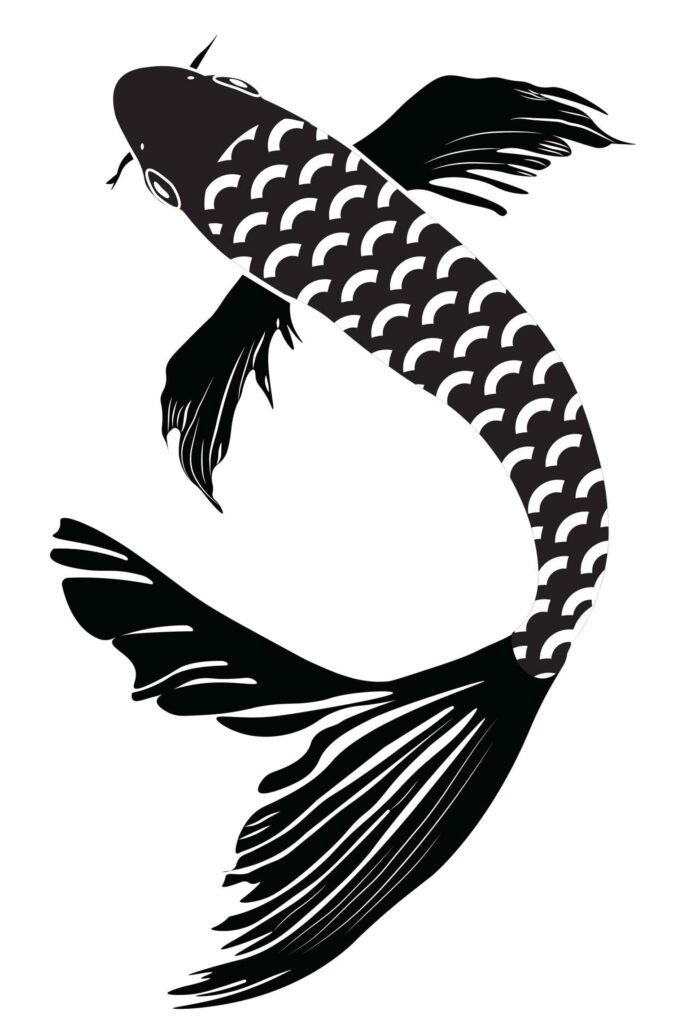
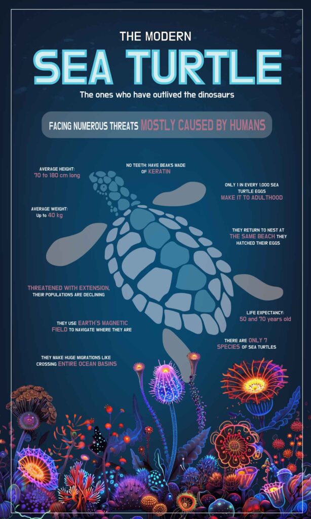
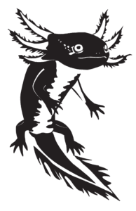
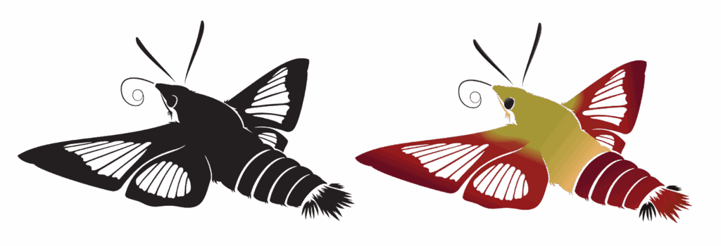
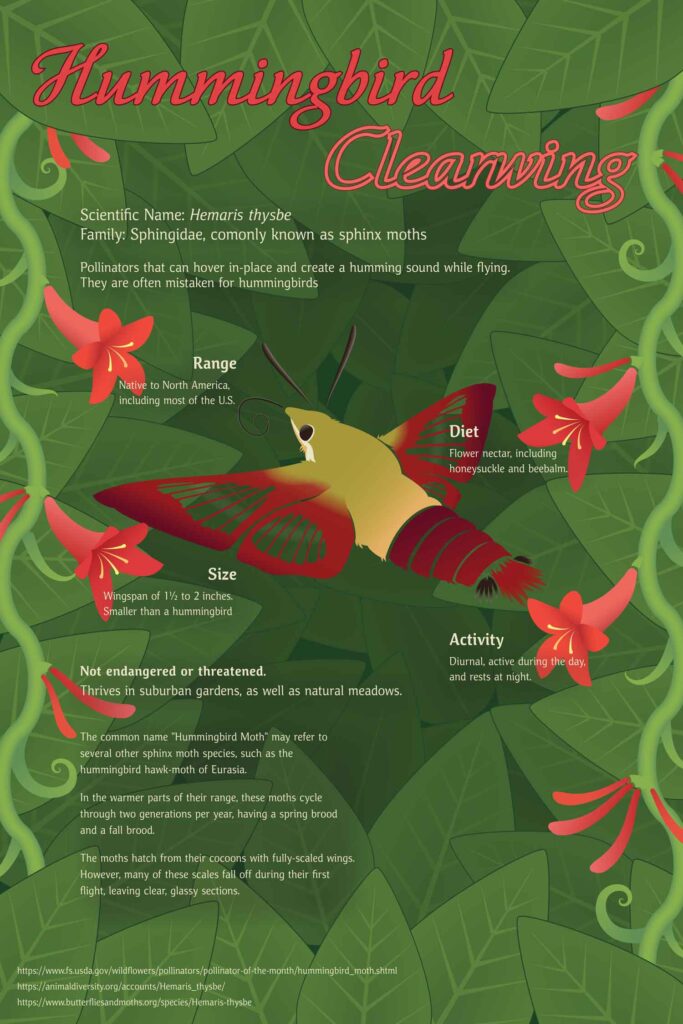
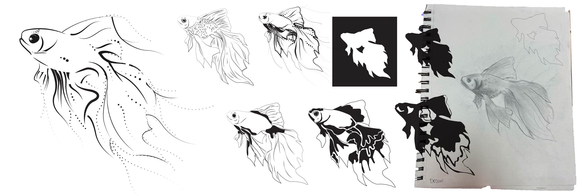
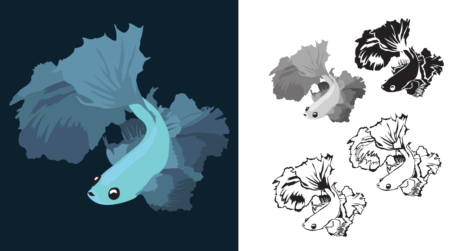
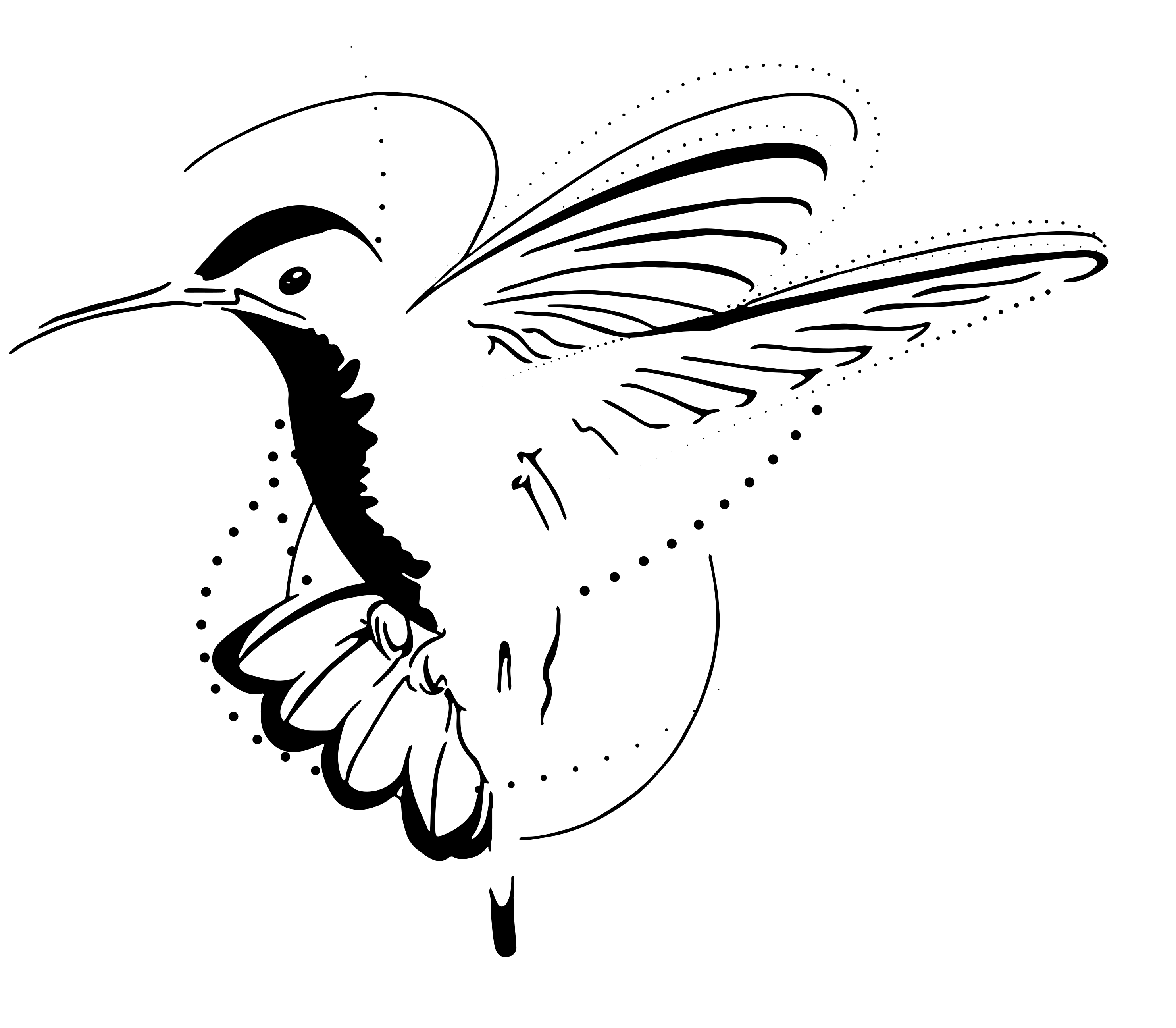
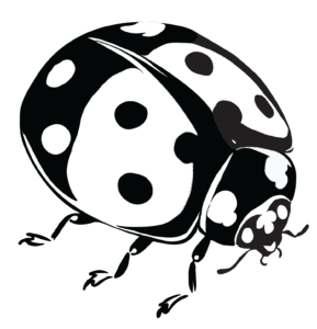
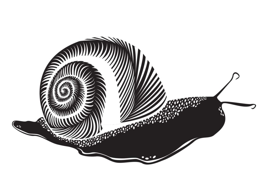
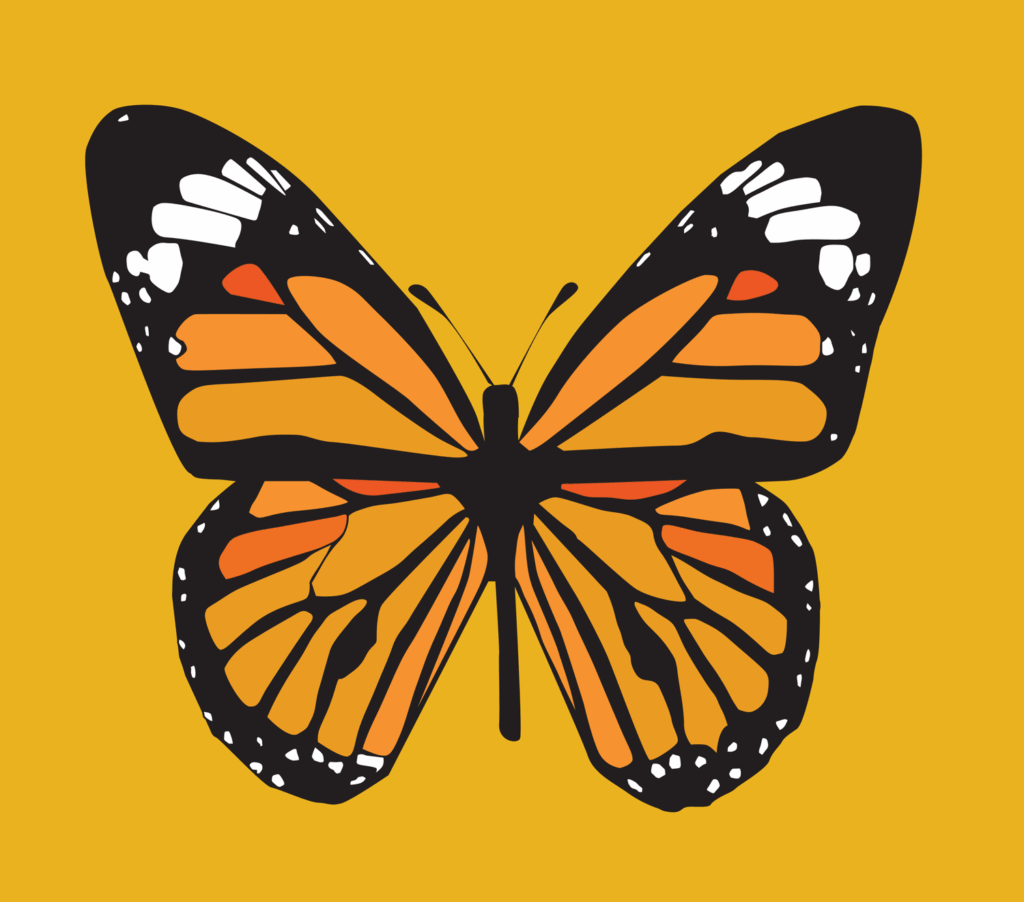
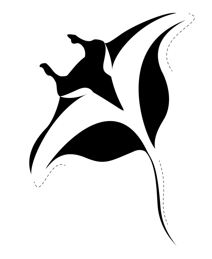
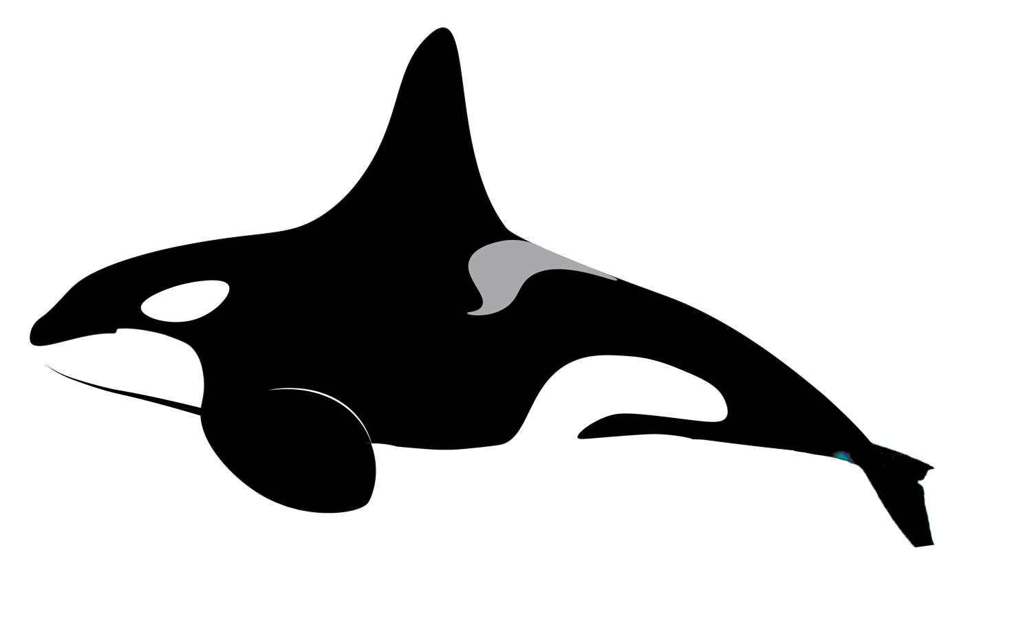
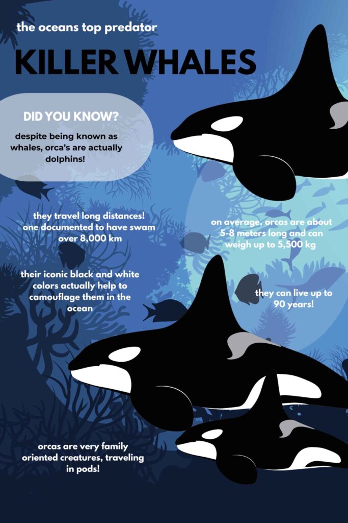
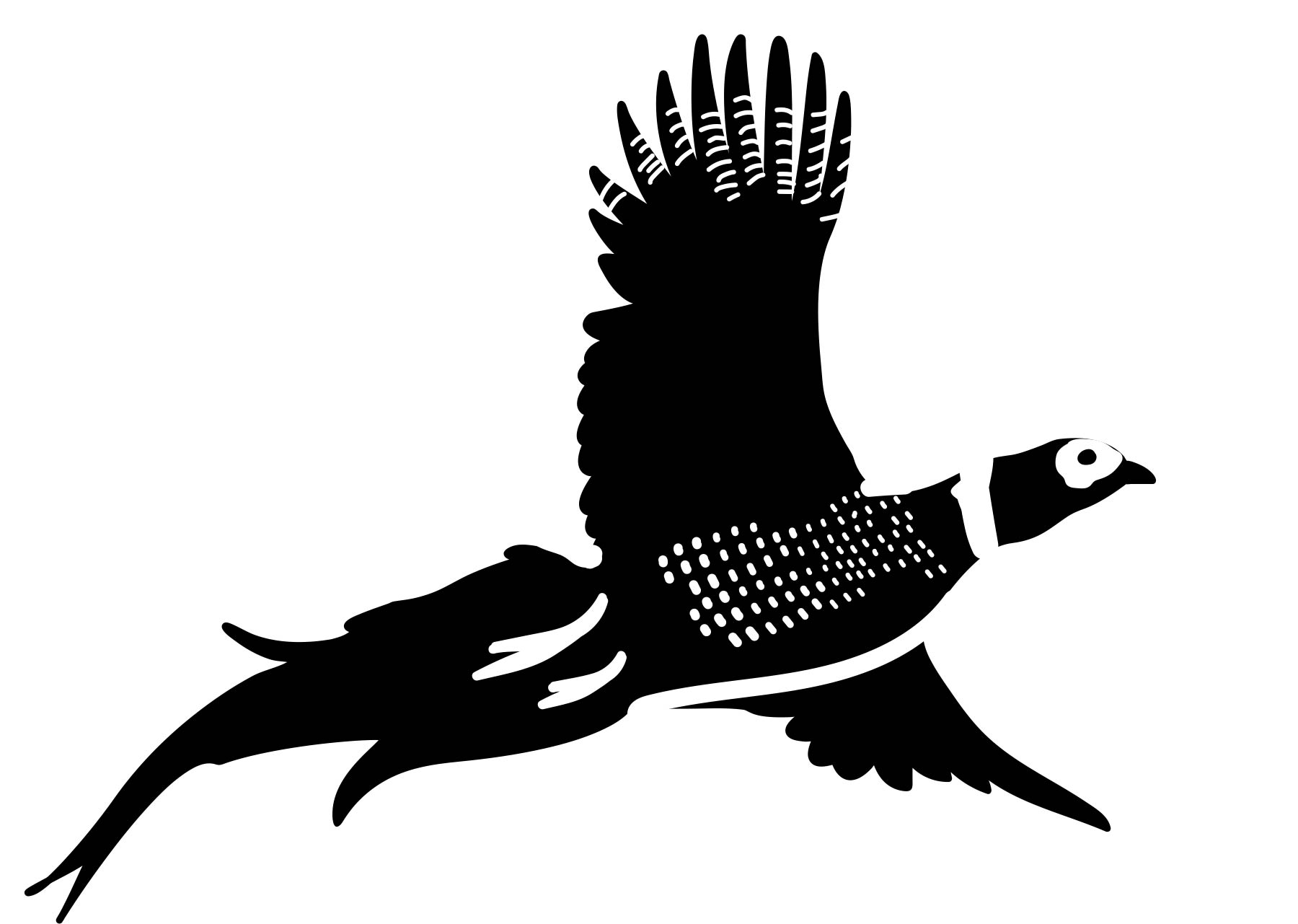
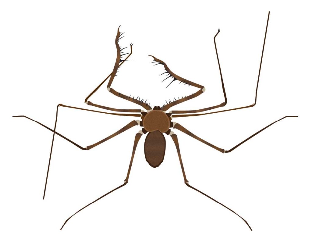
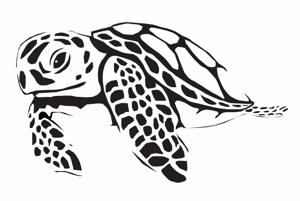
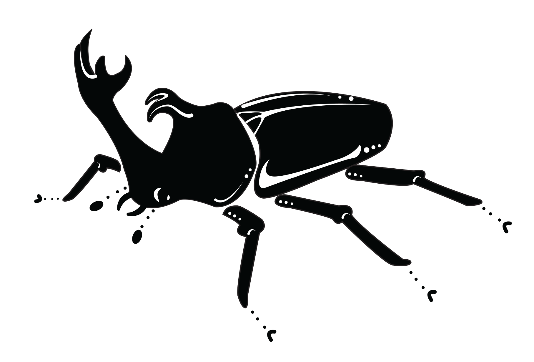
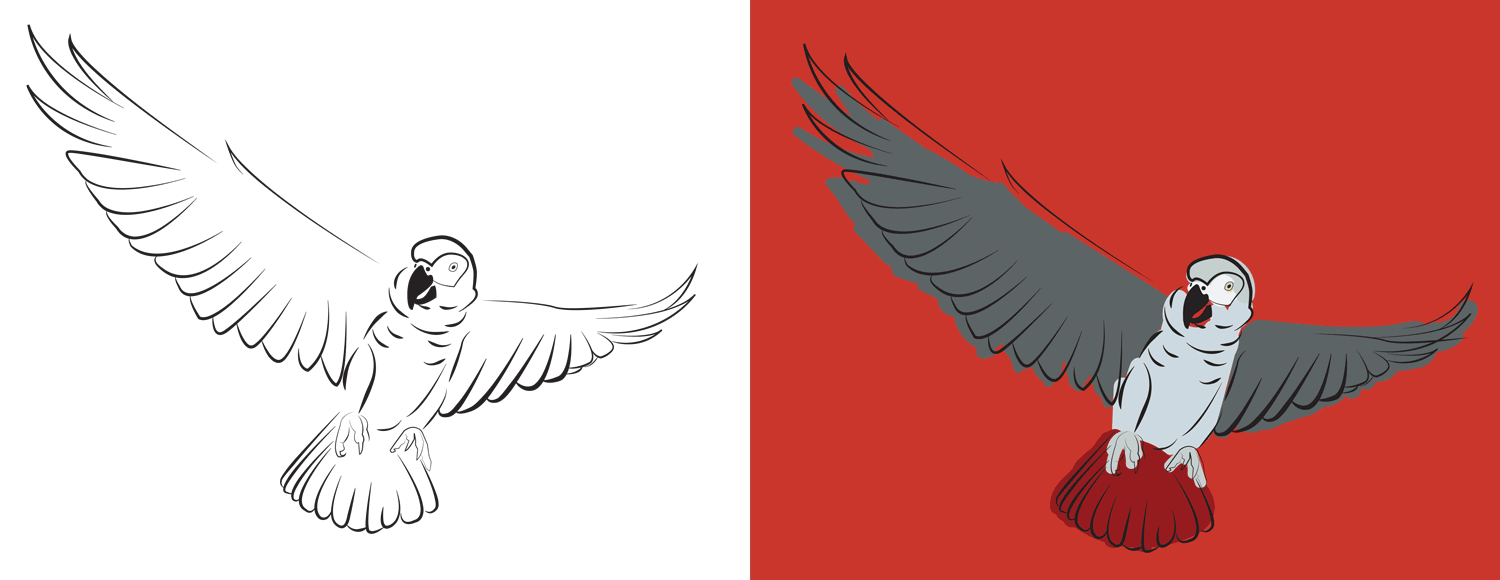
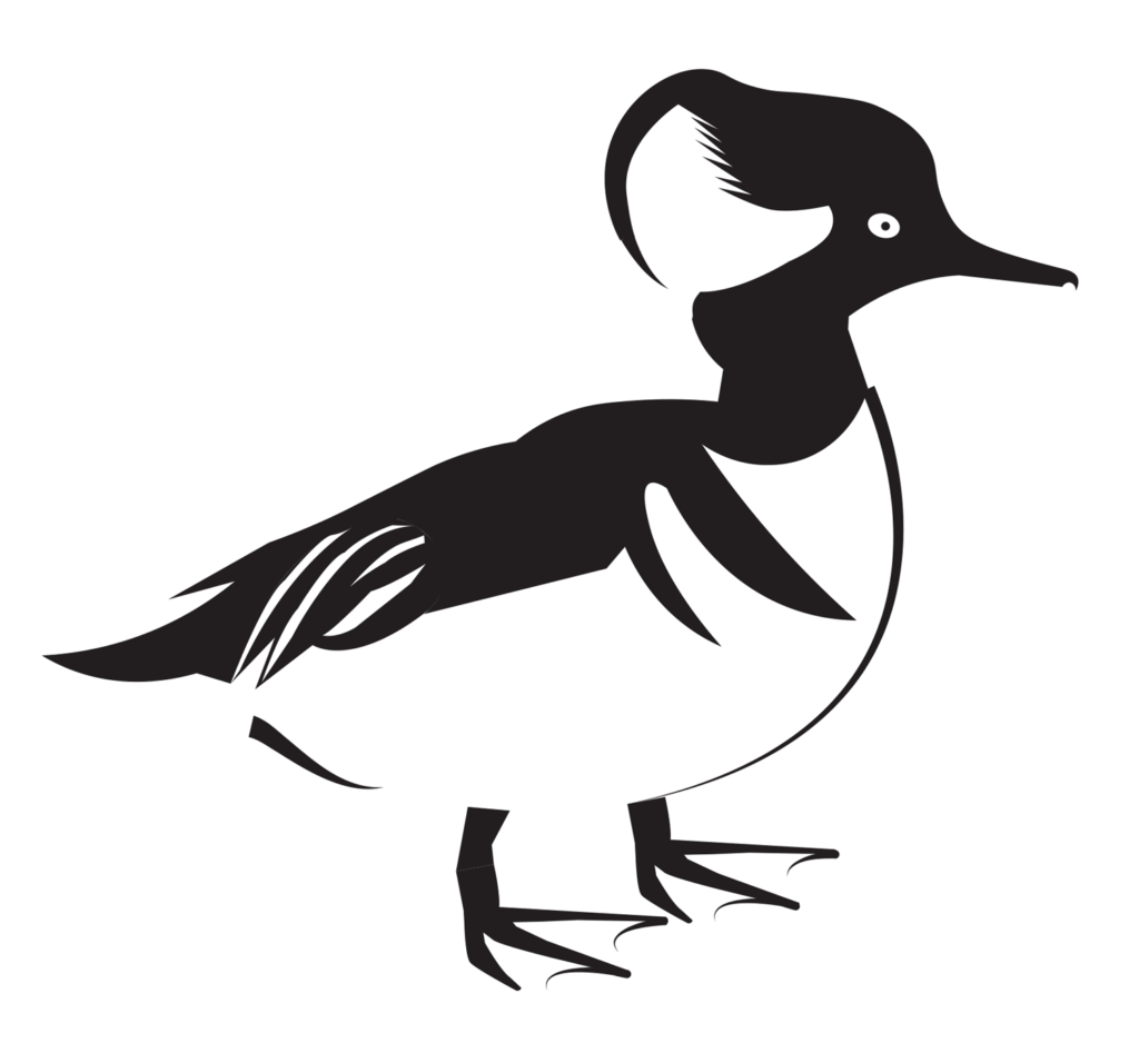
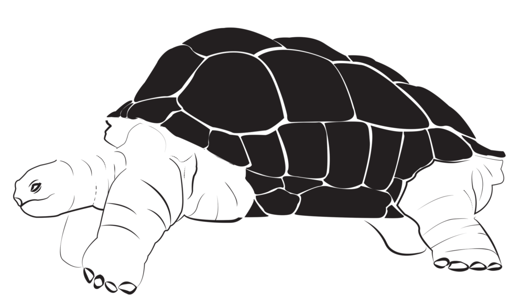
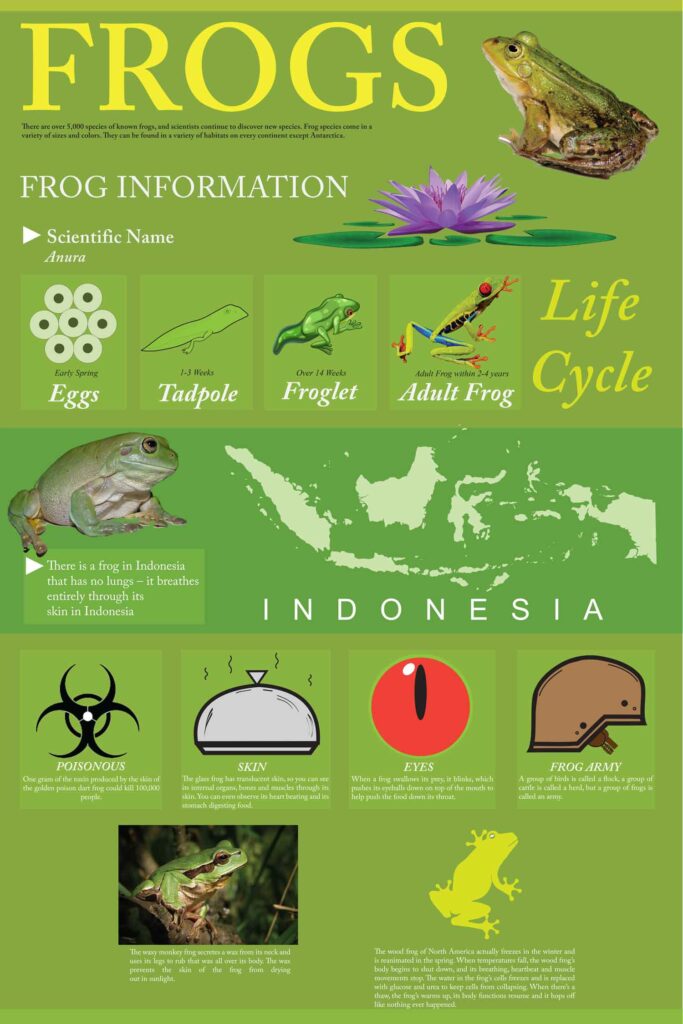
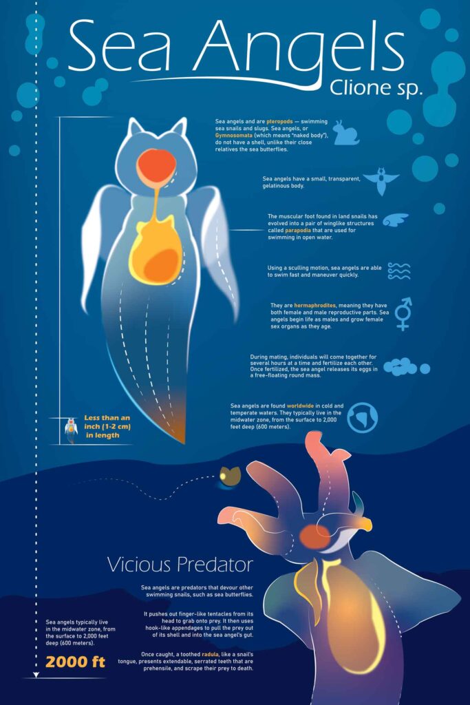
In this project, students were asked to create a graphic translation of an animal, bird, or insect — beginning with simplified, black-and-white visual forms. The objective was to explore how abstraction, reduction, and stylization could be used to communicate the essence of a subject without relying on photographic realism.
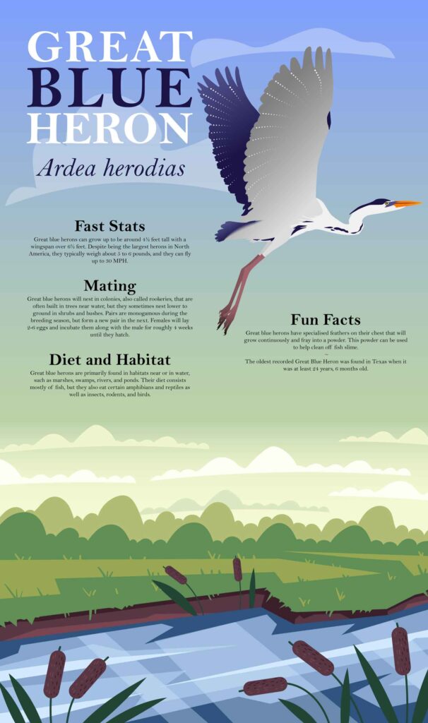
The process began with observational drawing, followed by an investigation of black-and-white form, focusing on shape, contrast, and structural clarity. Students then developed a color version informed by their subject’s natural palette, as well as an environmental color study based on the habitat or ecosystem of the animal. A final iteration required each design to function as a small-scale icon, emphasizing clarity and legibility at reduced sizes.
Translations reduced in size ad modified to serve as smaller icons, George Mason University, Fall 2025
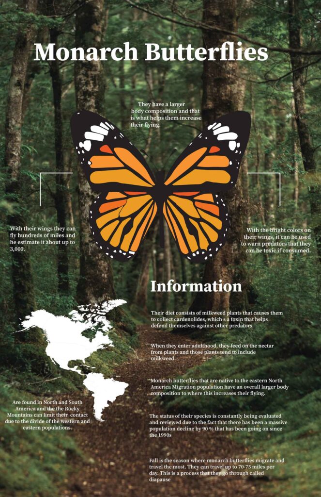
The final deliverables were scaled and applied to large-scale formats such as billboards, informational graphics, or architectural banners — pushing students to think critically about proportion, visibility, and graphic impact in public or environmental design contexts.
Project Goals
-
Develop skills in visual abstraction and form reduction
-
Translate representational subjects into scalable graphic elements
-
Strengthen understanding of line, shape, texture, and contrast
-
Explore how symbolic visual language can replace photographic imagery when needed
Process + Critique
In critiques, students discussed how their work achieved a sense of visual resonance through form alone — especially when traditional image-making might not be suitable or accessible. Students also examined how formal elements such as point, line, plane, shade, and shadow contribute to both character and clarity in design.
Throughout the project, students engaged in a hands-on workflow using both manual drawing and digital tools. The resulting work demonstrates a wide range of approaches and creative interpretations — from the bold and geometric to the delicate and gestural.

