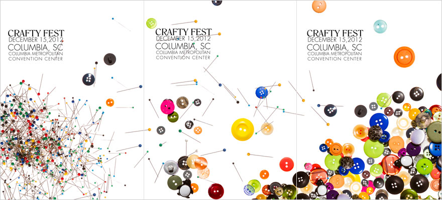
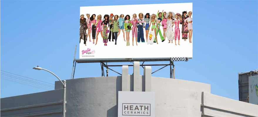
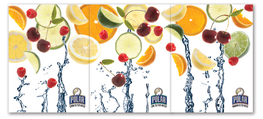
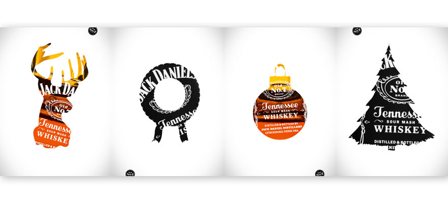
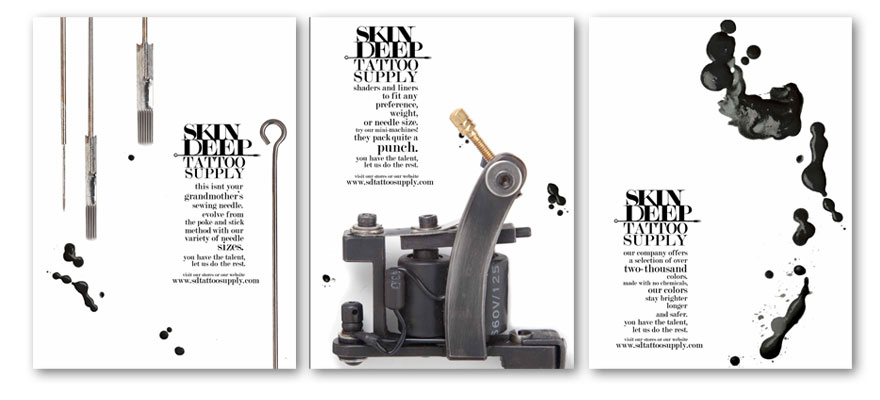
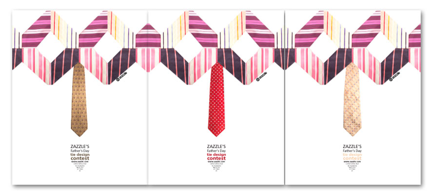
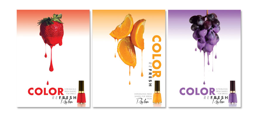
These poster designs were a collaborative effort between the Graphic Design and Photography students at the Boston University Center for Digital Imaging Arts. The assignment was to create a series of posters on a subject matter of their own choosing, but every facet and element of the finished poster designs had to be original art and photography. All photography had to be done in the studio setting under the roof of the school. The finished poster series could work as a series of closely knit layouts or work as a continuous landscape when the three posters were put side by side. In any result, the individual posters needed to work as successful poster designs even when not accompanied by the other posters.
The students in their respective departments went through a set of early classes that laid the foundation for this project. The design students worked with learning design principles of composition in addition to the appropriate technical skills. Photography students learned lighting principles in studio settings and became skilled in photographing a large variety of objects, surfaces, and settings. Photo students also became adept at problem solving for all unexpected compositions, lighting conditions, and learned control of inherent shadow and reflected light situations.
During these early classes, the graphic designers created a rough layout for the posters. They temporarily created imagery they themselves photographed or stock imagery that was used for position only until the photoshoot. Designers were also charged with bringing in all components of the subject matter for their posters including complex or patterned backgrounds. The photographers were never privy to the layouts or subject matter until the time of the photoshoot. They were charged to problem-solve all lighting and compositional conditions as they arose. There also needed to be clear communication between photographers and designers to produce the work. This was one of the objectives of this experience. Instructors troubleshooted layouts one week prior to help foresee any complicated situations and help guide students if last minute problems arose. But one of the other objectives was to have photographers and designers to think on their feet.
This course stemmed from the idea that designers develop and integrate images and words to represent ideas and objectives. In many cases, the images designers work with will not originate from the designer themselves. Designers will inherent photographic artwork from their clients. In many cases, these photographs are created within their own assignment. Little thought is given to their uses on a screen or printed medium. Yet, the creators of graphics and photography have a narrow grasp of how each of the other goes about their work and may not be aware of the processes each goes through to create their work and visions. This is true in many educational circles, where students of each major may rarely cross paths with the development of course work in another major. Yet, the two professions of design and photography are consistently represented in today’s marketplace side by side. One sees this throughout websites and posters and books. These poster designs offered students an opportunity to help bridge the gap of professional empathy.
This cooperative process between departments also help students learn that images and typography, especially ones that are totally original, can be powerful and stimulating avenues of communication. Design solutions can not only achieve their informational goals, but transcend those pragmatic objectives and convey moods and emotions that create a more lasting impression to an audience.
The following examples are results and all design and photographic elements were created on-site at the Boston University Center for Digital Imaging Arts.

