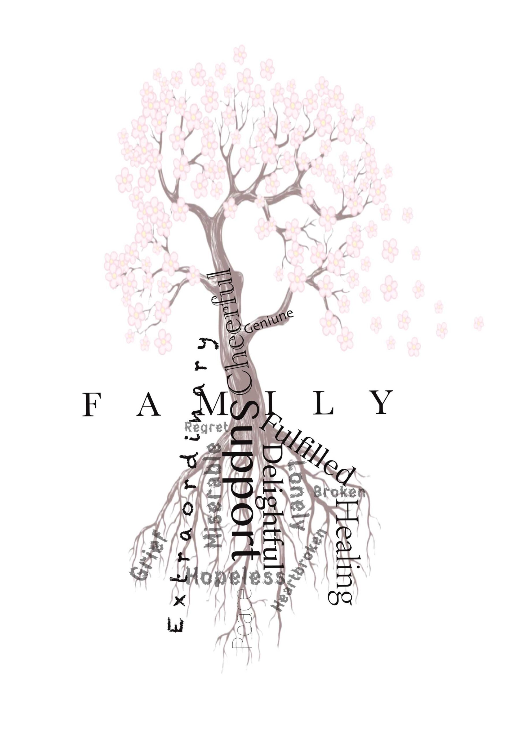
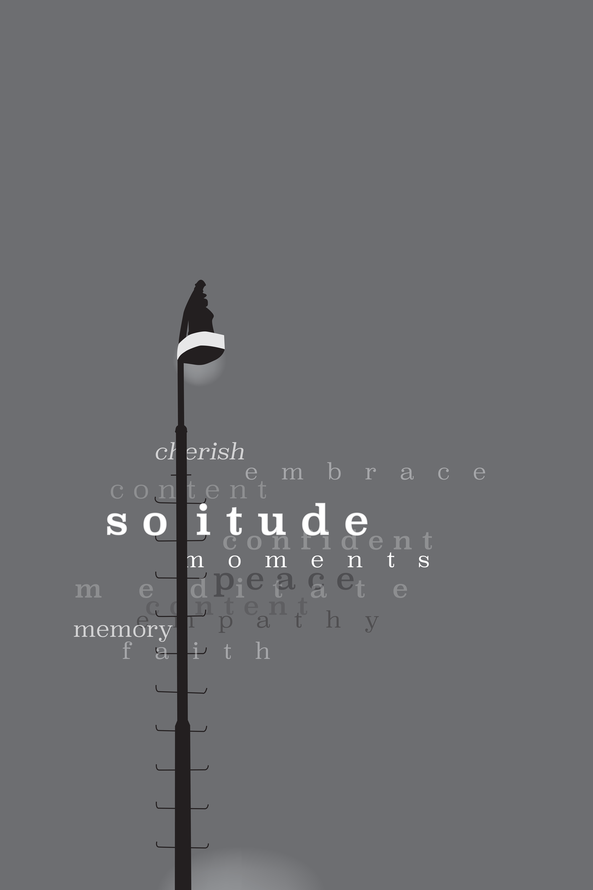
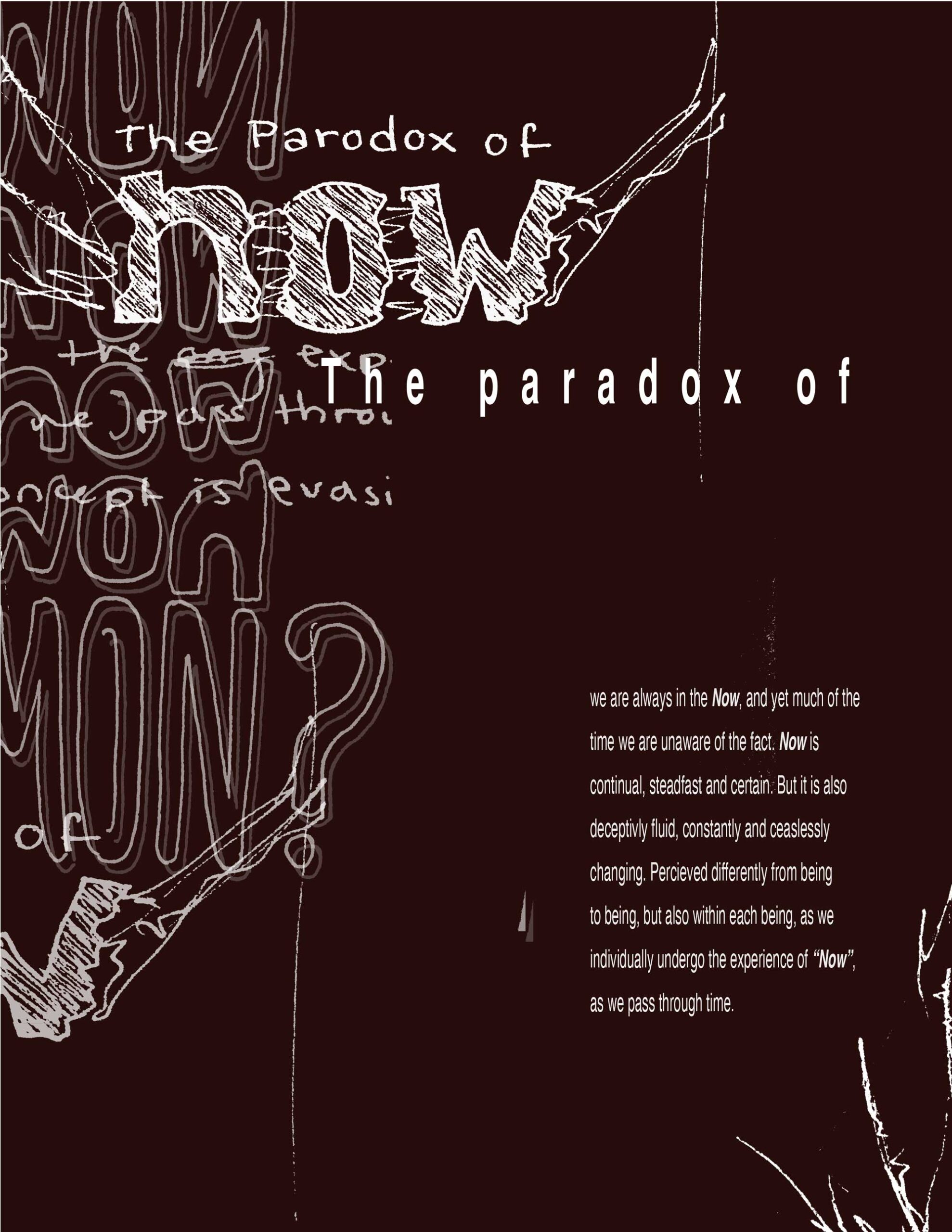
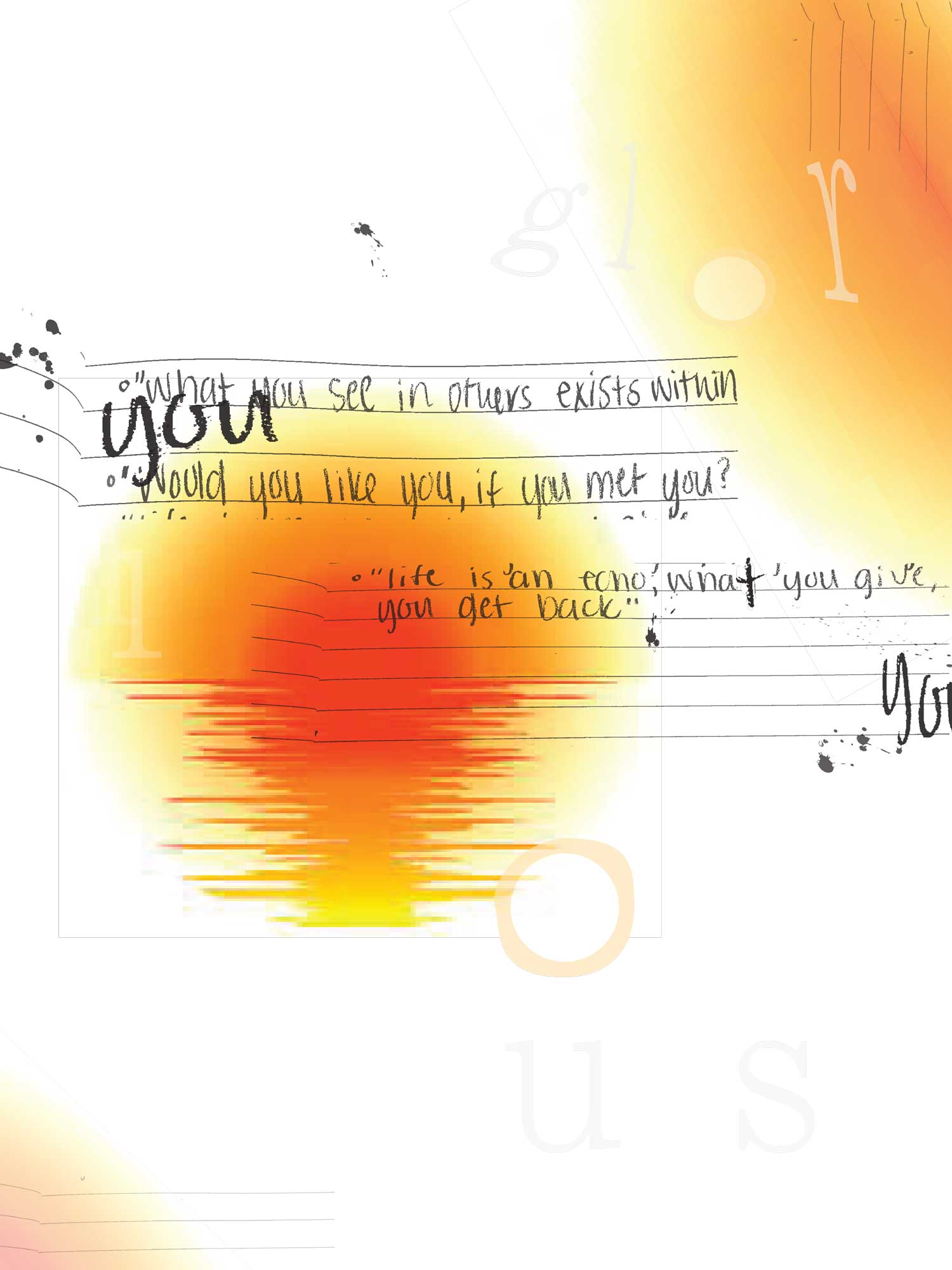
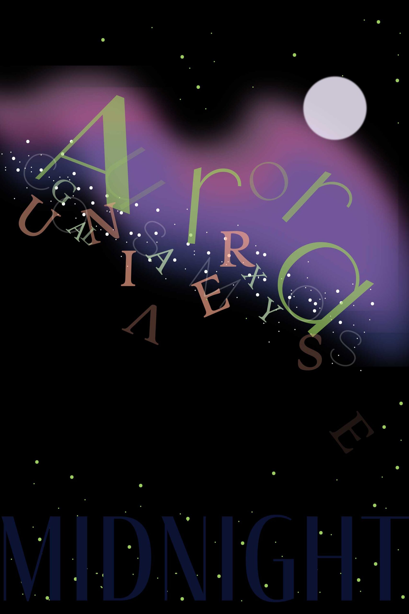
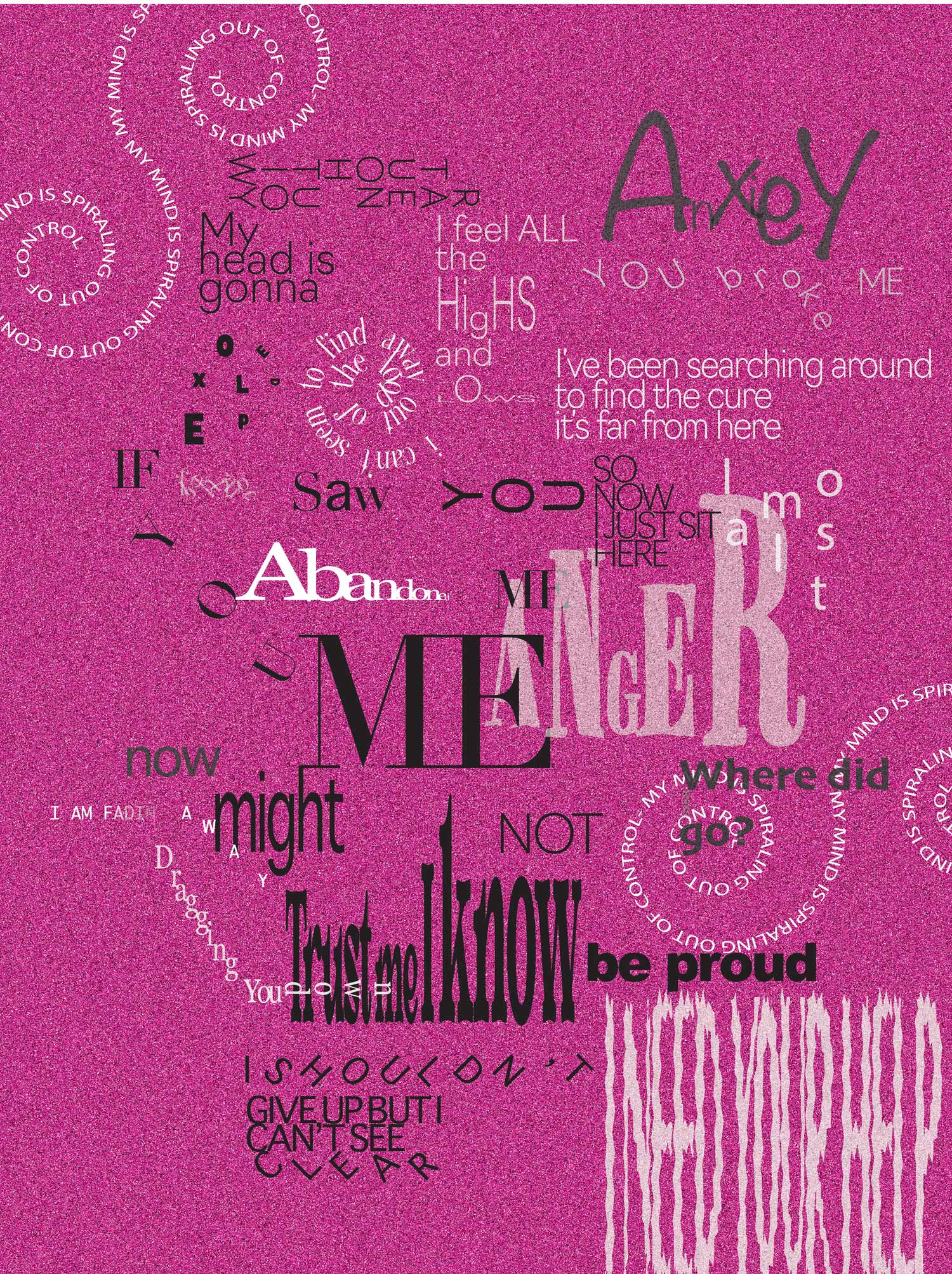
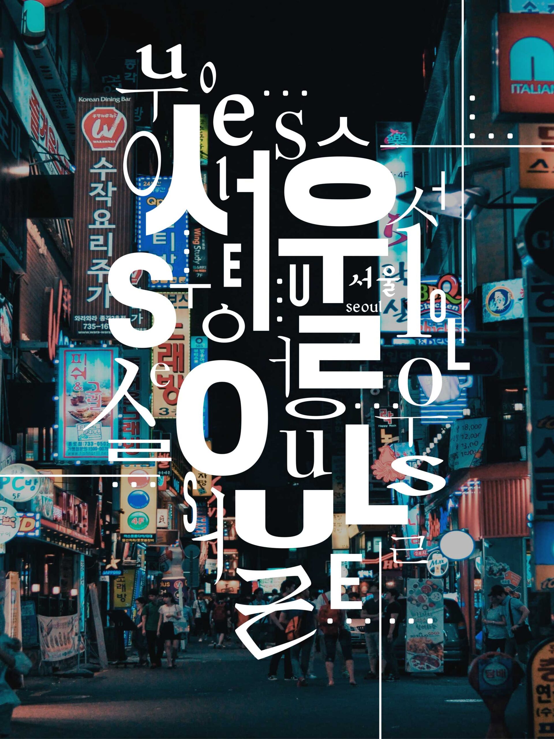
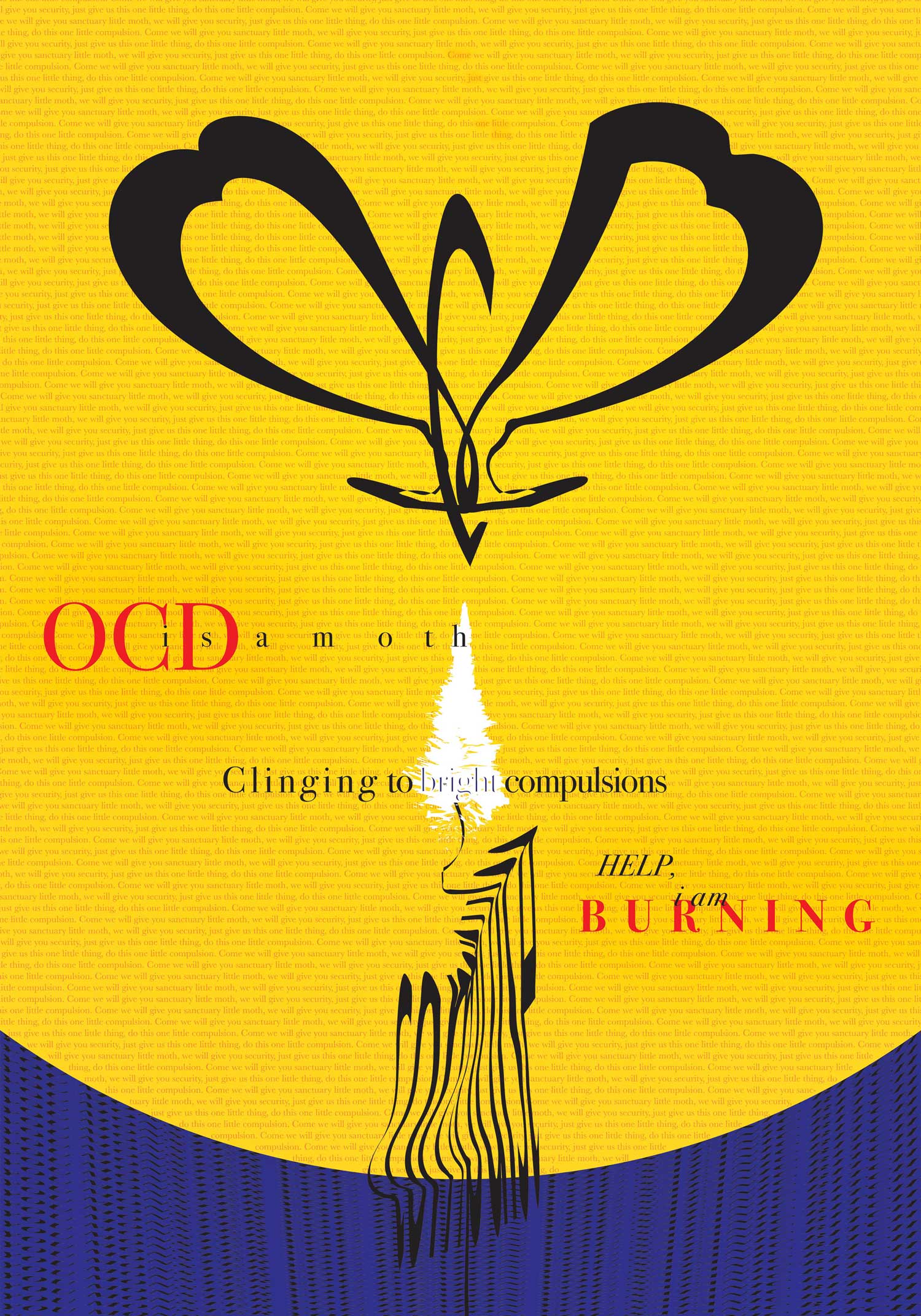
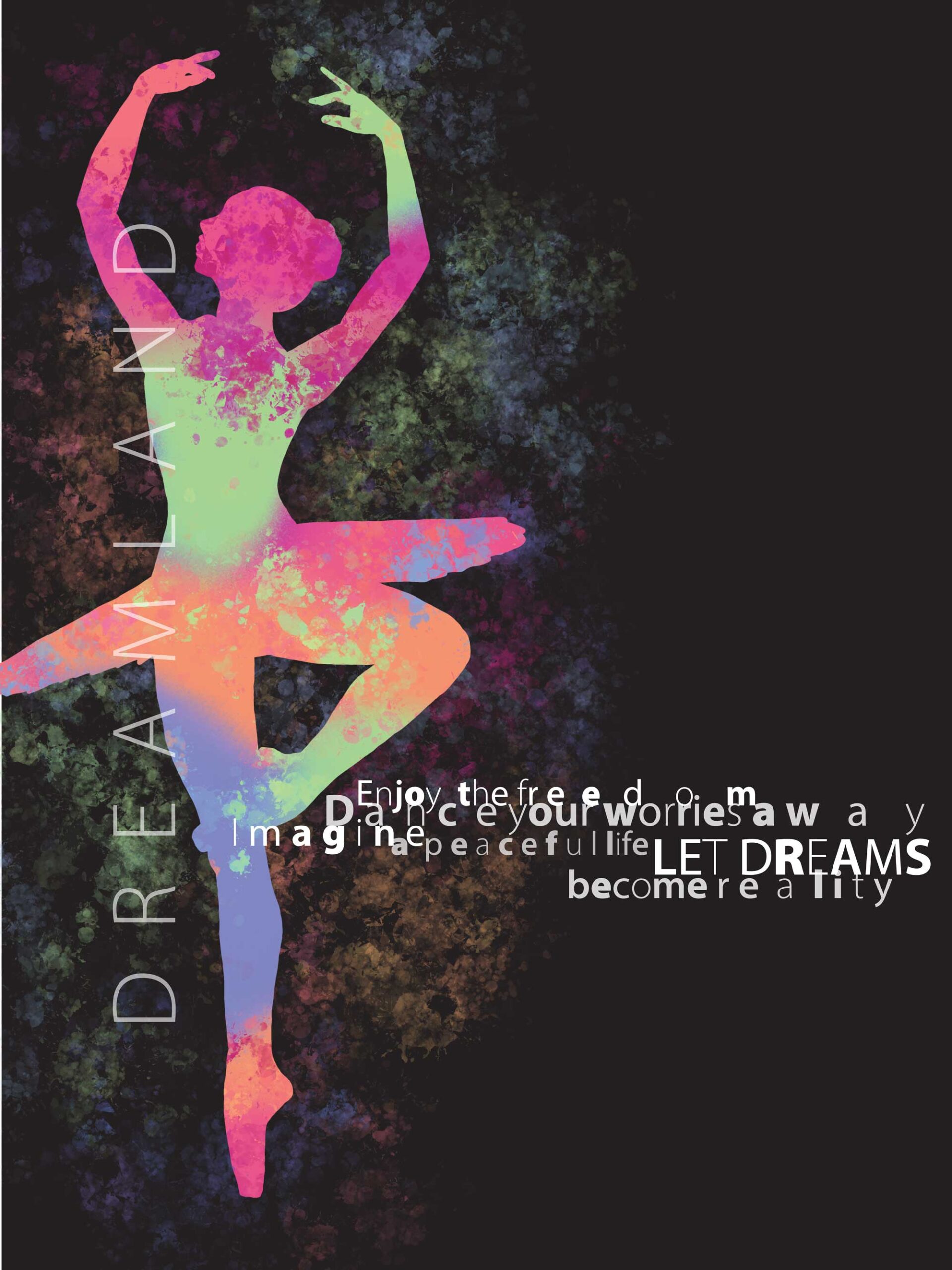
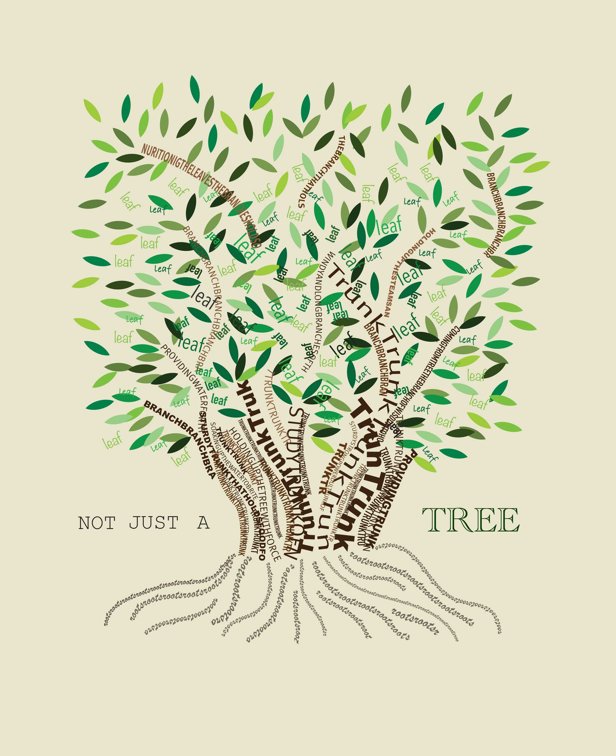
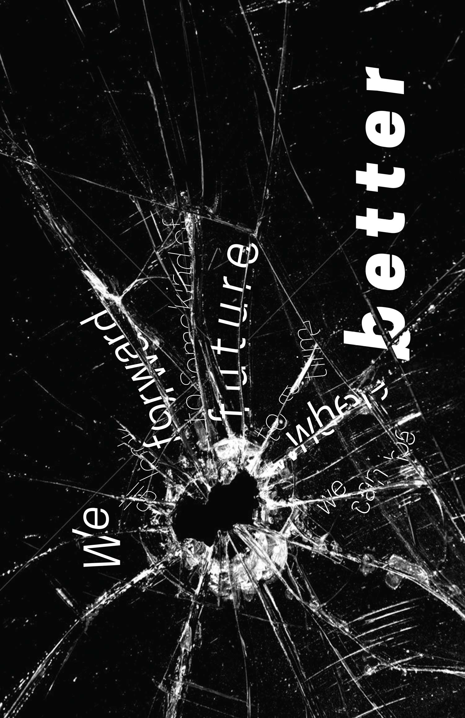
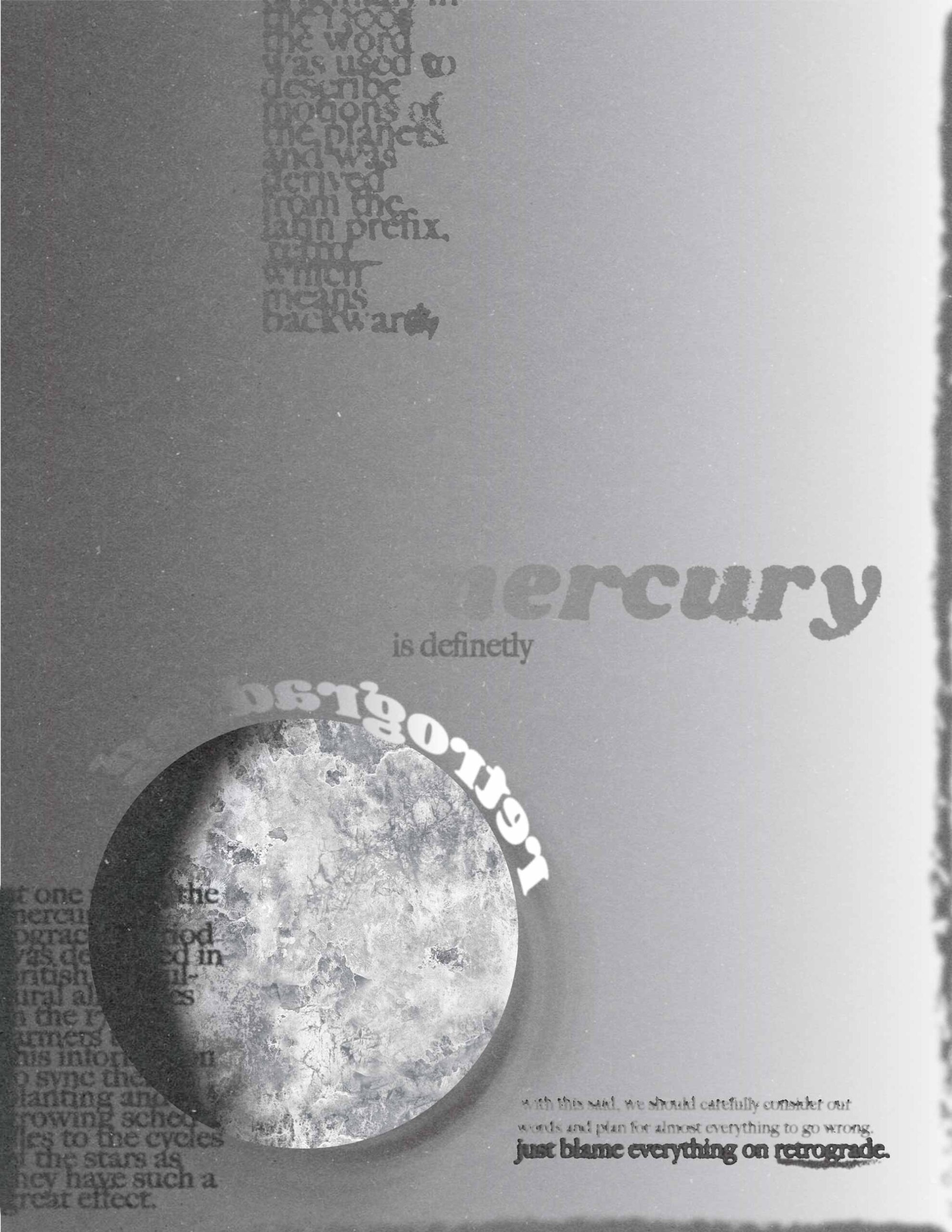
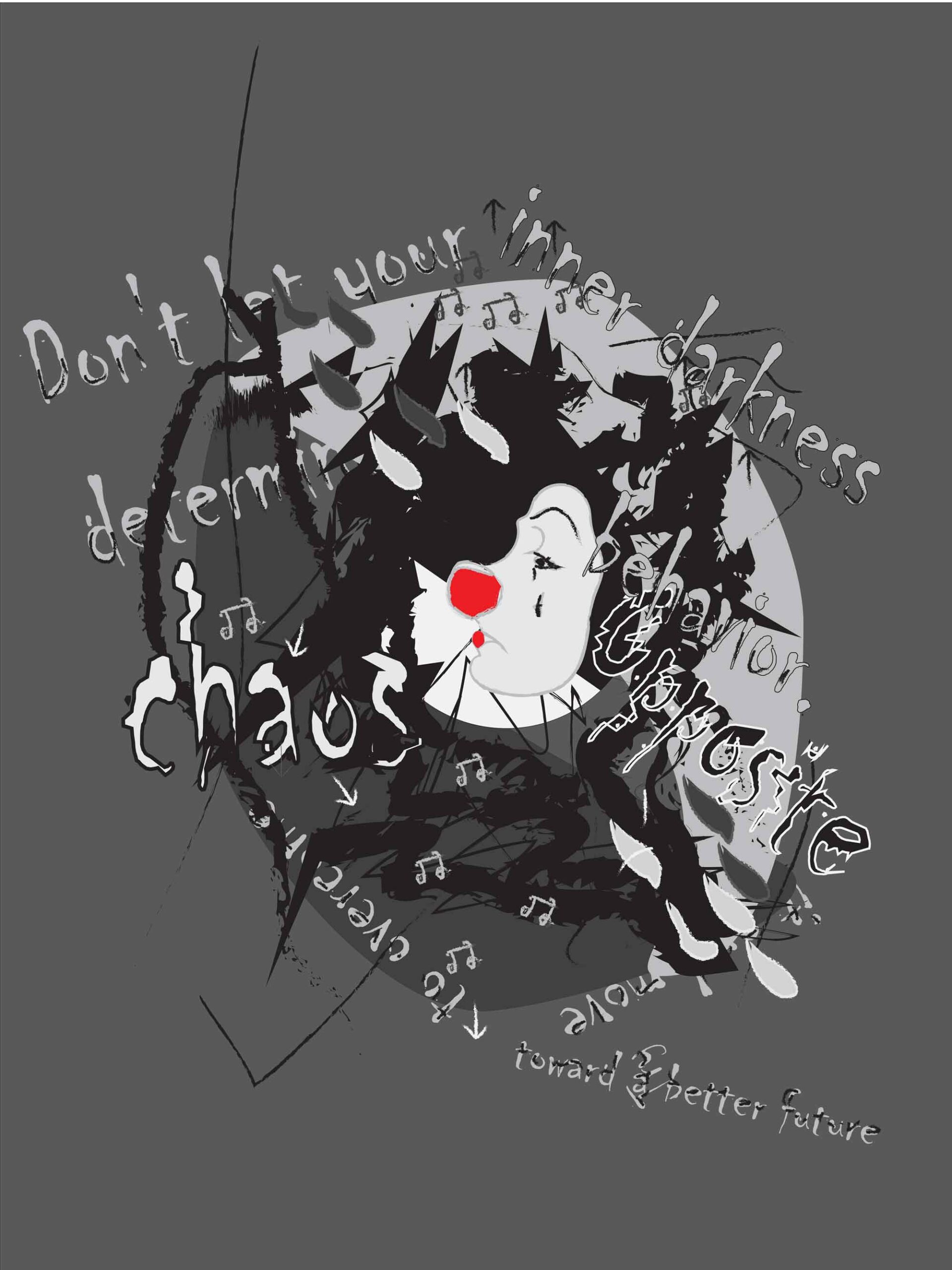
Students developed the following poster designs as a visual interpretation using their own written content. This project was the culmination of a first-semester graphic design typographic class at the University of Minnesota, Duluth. Students first chose a set of words of their own liking and then investigated how those words may fit into grammatical structures such as clauses, phrases, sentences, and short paragraphs. Other forms of content that students were welcome to investigate could be their own poetry or excerpts from previous writings. Additional writings could also be developed specifically for the assignment or taken from one of their other liberal arts classes. Students were then asked to respond to their work in a figurative and expressive way.
Earlier in the semester, students were introduced to letterform anatomy and basic typographic principles. Additional exercises and projects expanded upon this initial knowledge before the expressive poster assignment was introduced. This final project was intended as an opportunity to push the boundaries of typographic conventions and explore the possibilities of type acting solely as a feeling of expression and a carrier of emotional resonance. Hand-drawn type and the distortion and alteration of letterforms were encouraged, investigated, and experimented with to achieve a visual dynamic while intensifying the meaning of their text. Looking at typography from an emotional standpoint was a new experience for many of the students.
At an undergraduate level, writing and design are still awkward bedfellows for many design students. This was by no means a writing class, but by creating a relationship between typographic form and verbal content, students are introduced to the emotional impact of typography. This complex relationship is also mixed in with the learning curve of technical considerations. Undergraduates are still grappling with rags, kerning, spacing and pacing, semantics, software, screen resolutions, and so on. Far more often than not, especially viewed through the lens of perceived marketplace expectations, typographic results become passive and safe rather than letting the process expand upon itself and seeing if students could further explore and investigate avenues outside of typical typographic conventions. Typography, in and of itself, can emote a feeling and have emotional resonance. Students begin to design solutions that are not of the everyday variety and are truer to their own selves.

