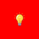
This assignment introduces students to typography as a visual language — one that can express emotion, meaning, and identity beyond the literal definition of a word. It also initiates students into the foundational question of typographic design: Can type speak louder than words?
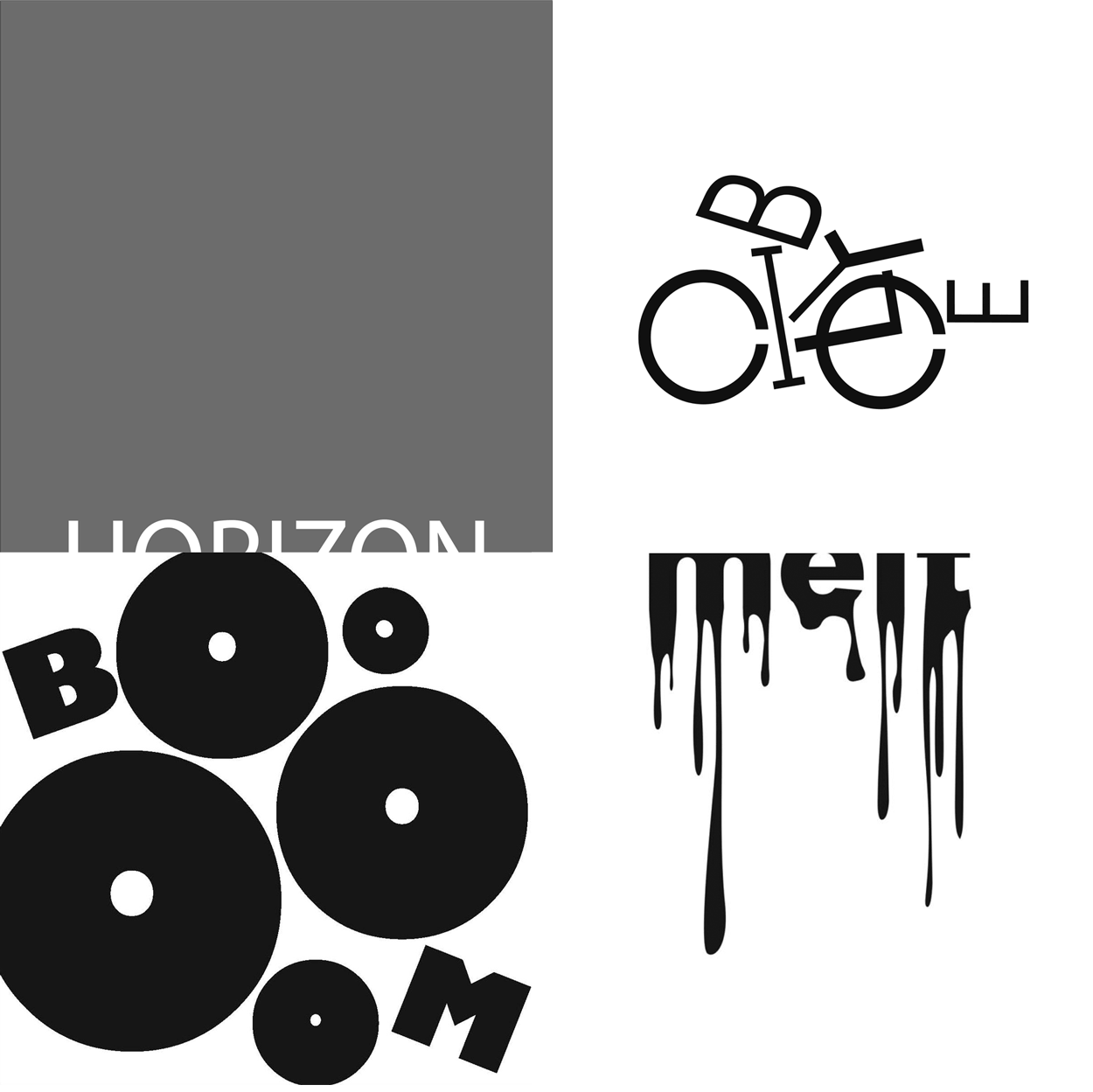
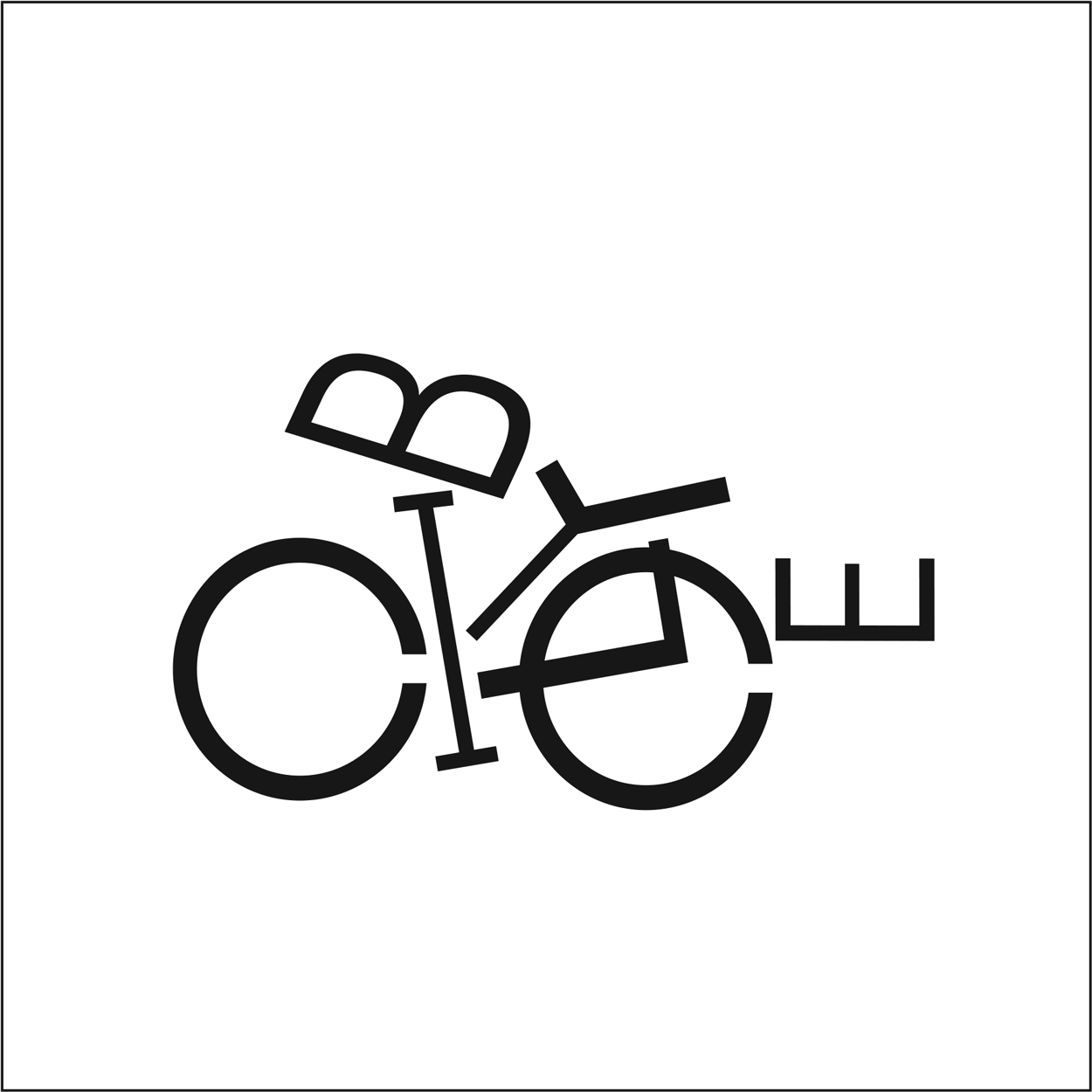
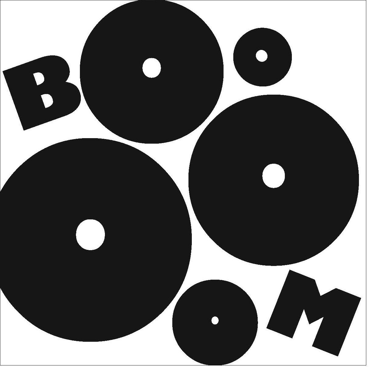
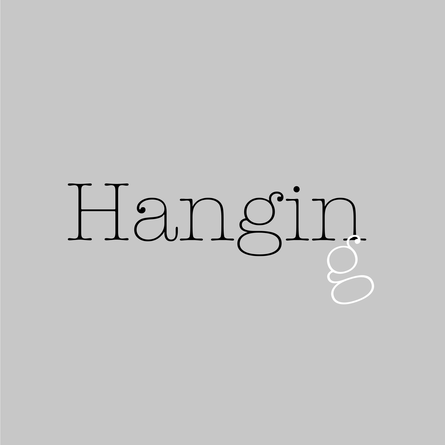
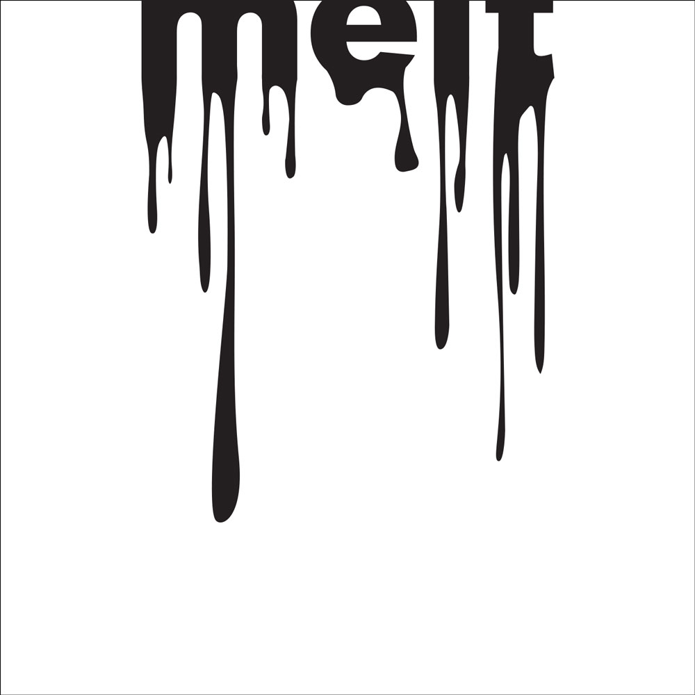
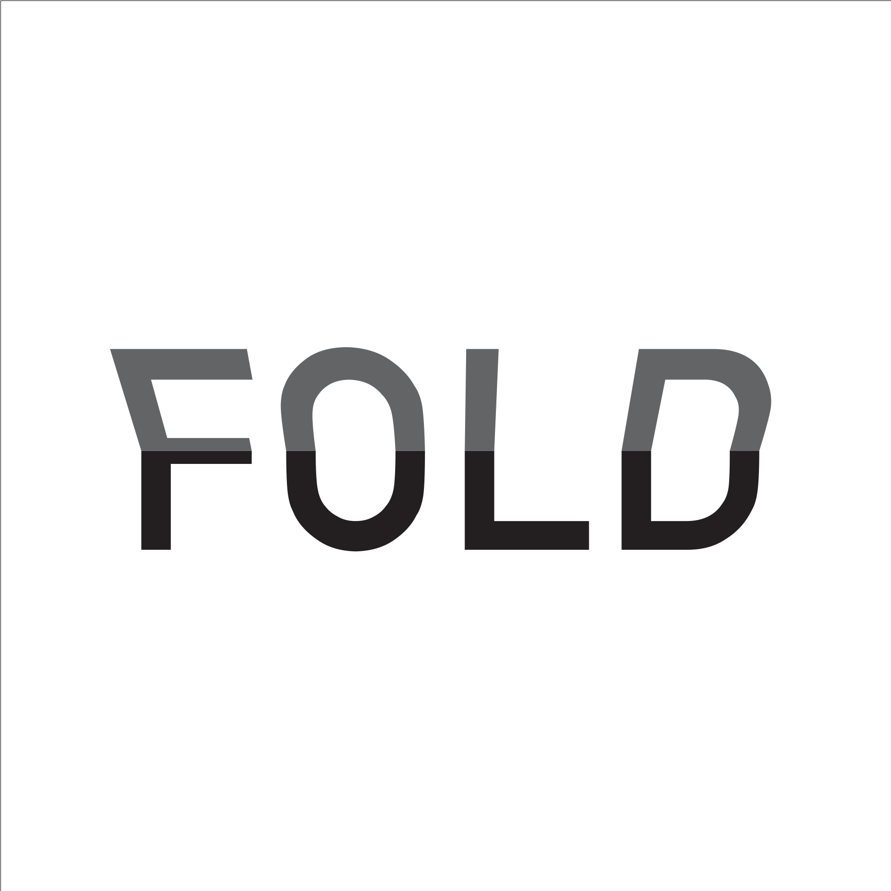
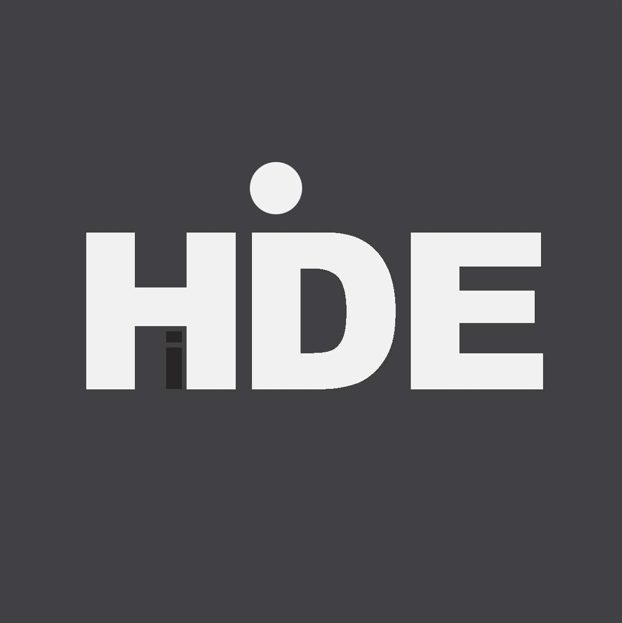
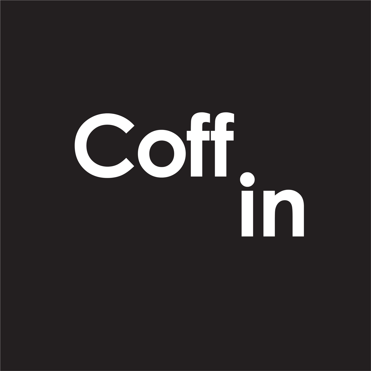
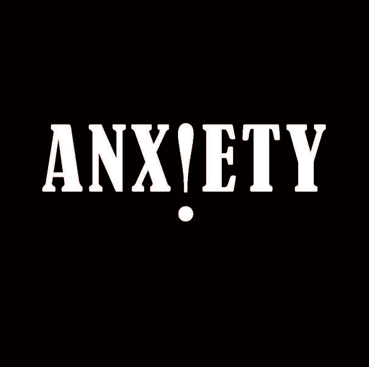
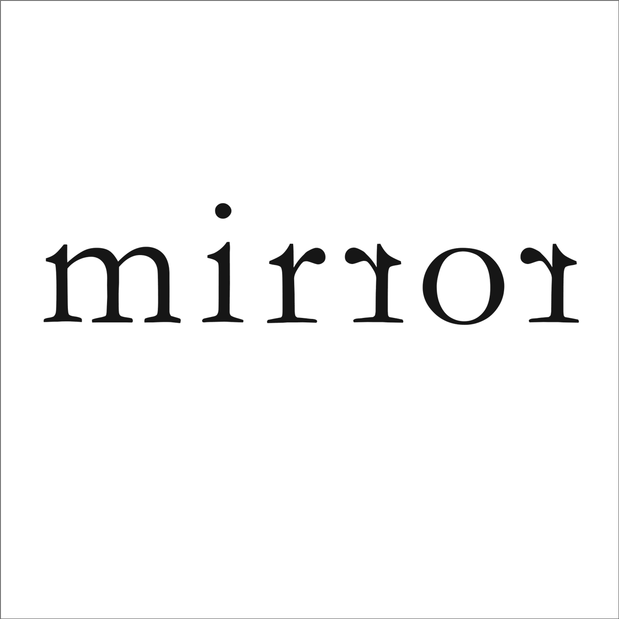
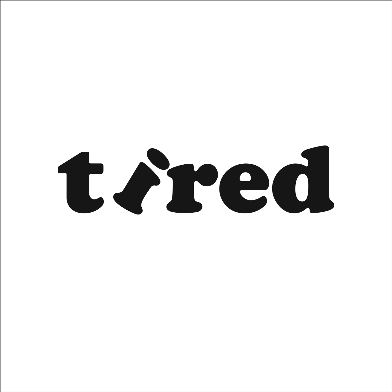
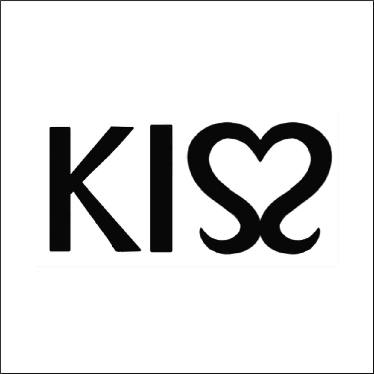
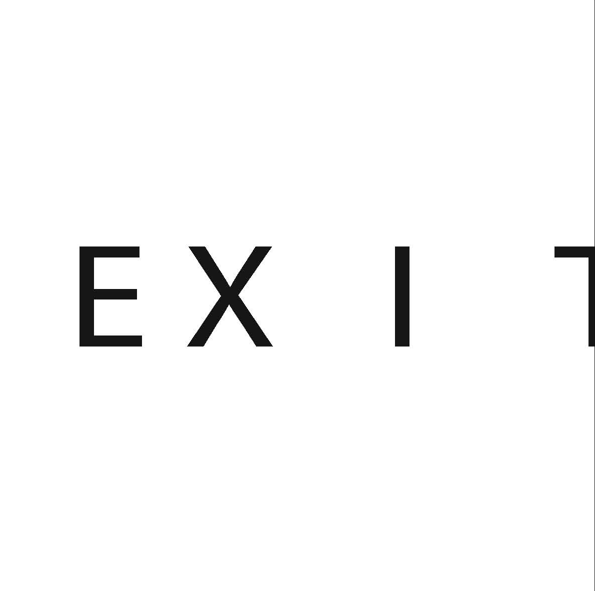
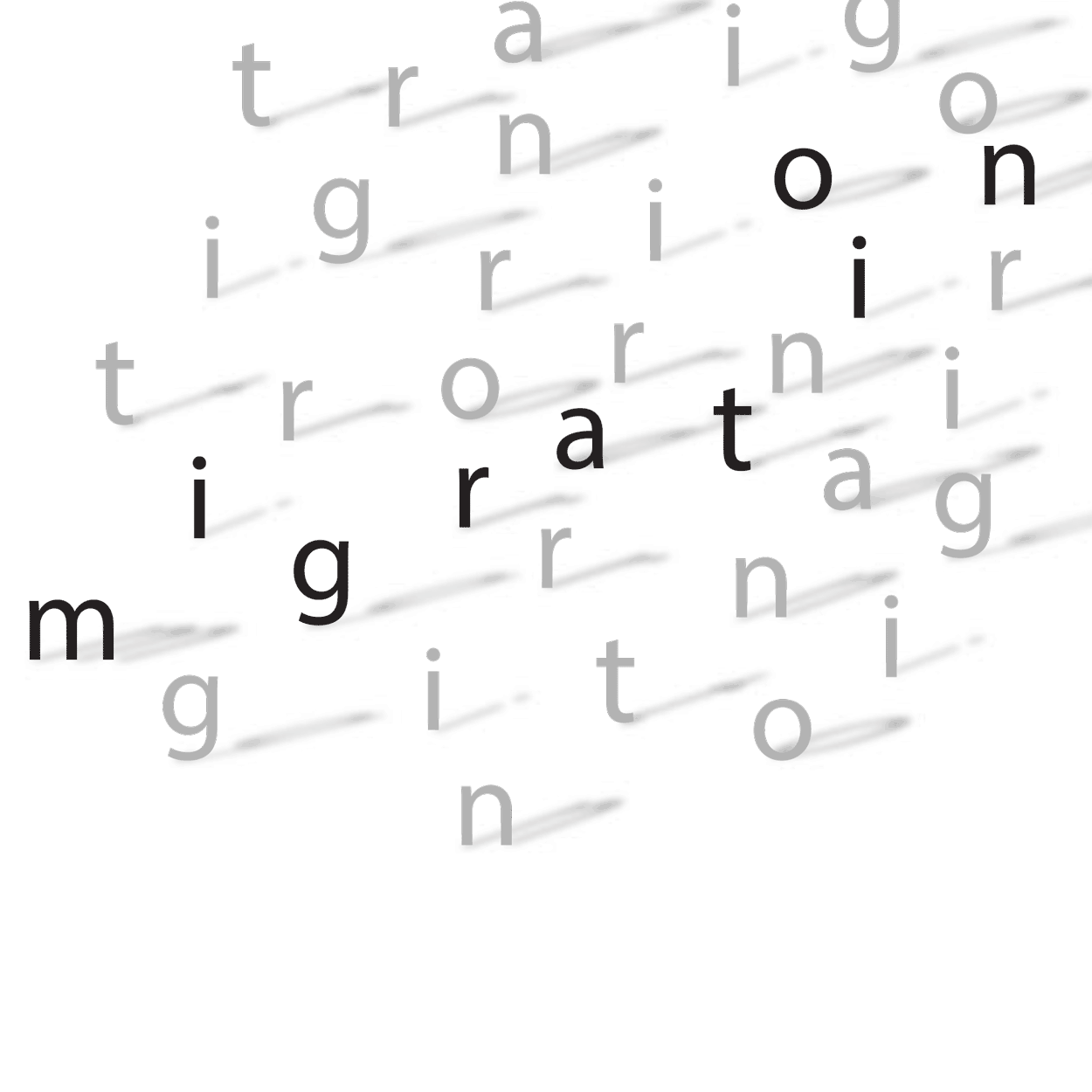
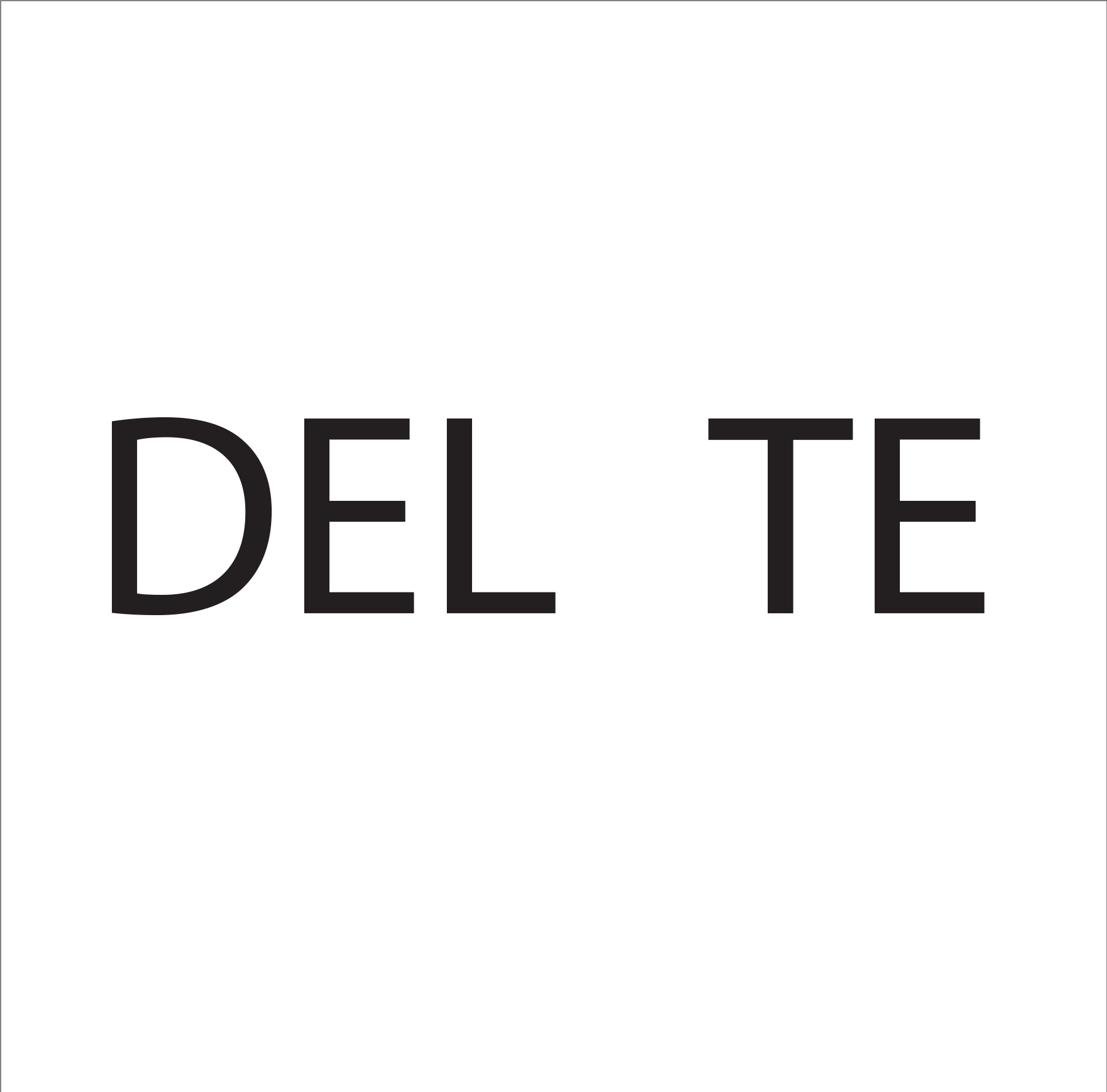
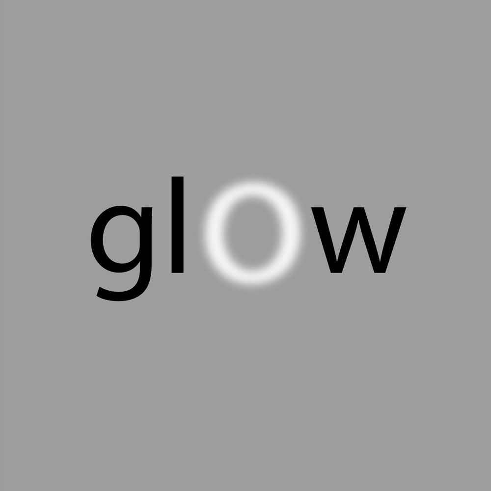
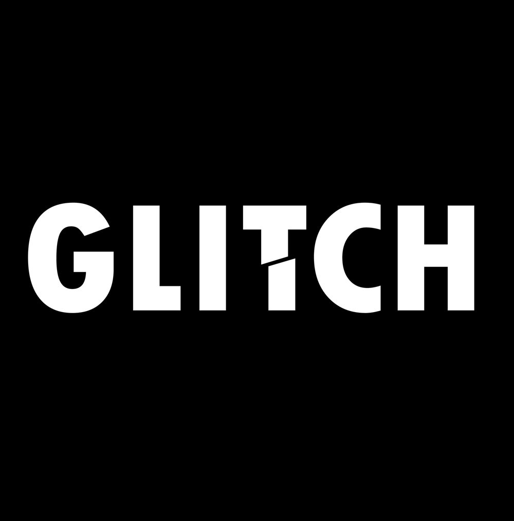
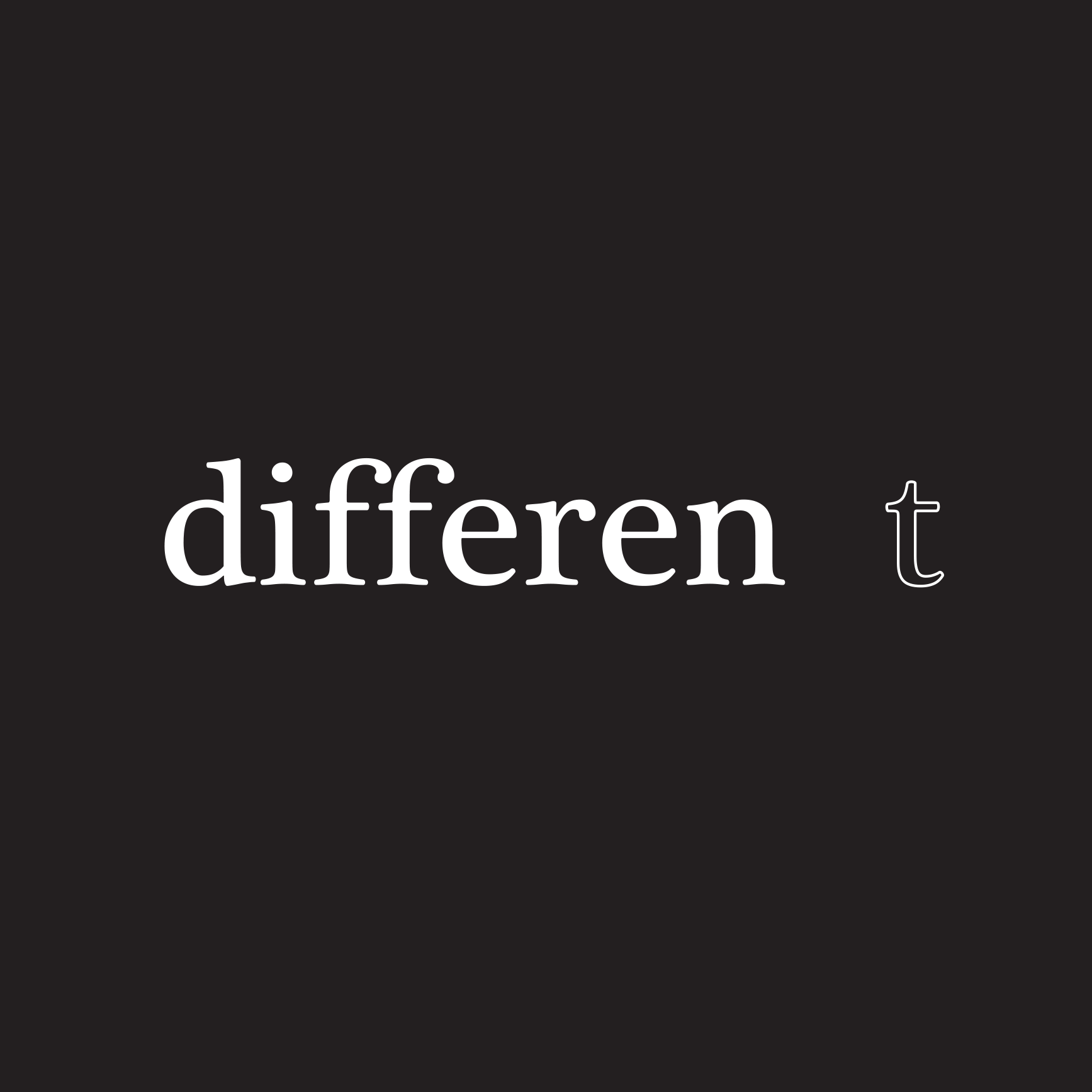
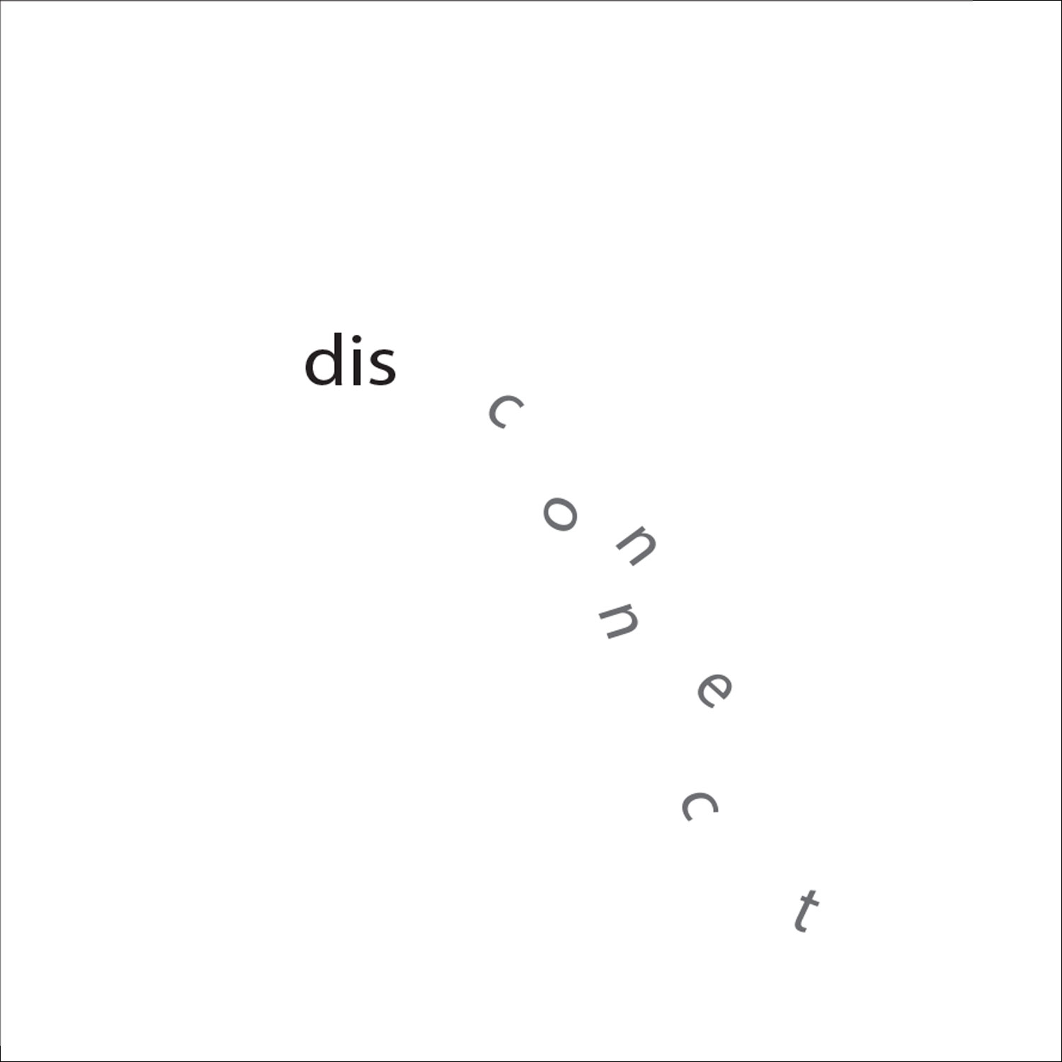
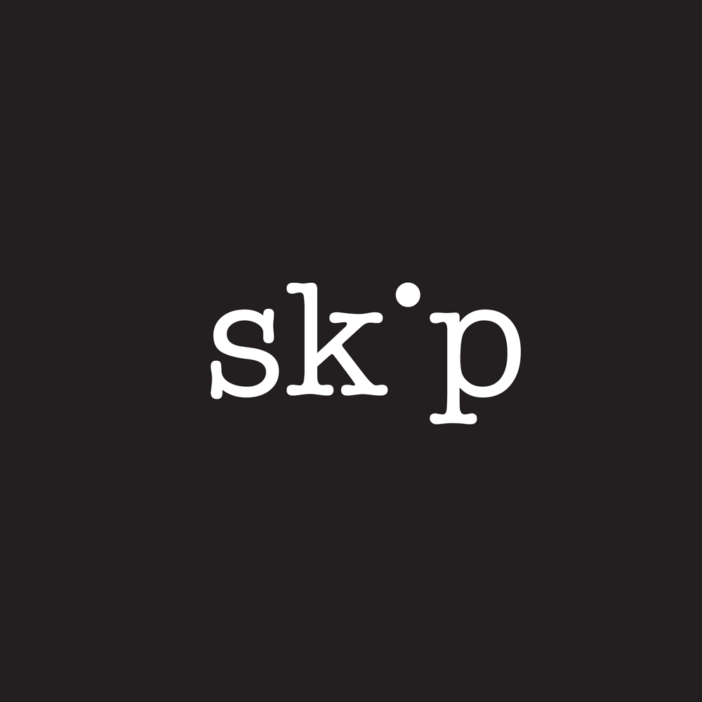
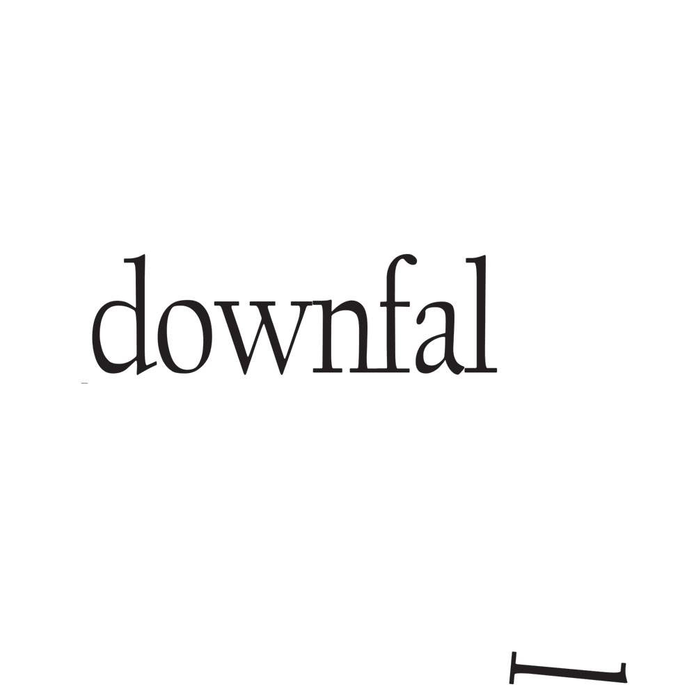
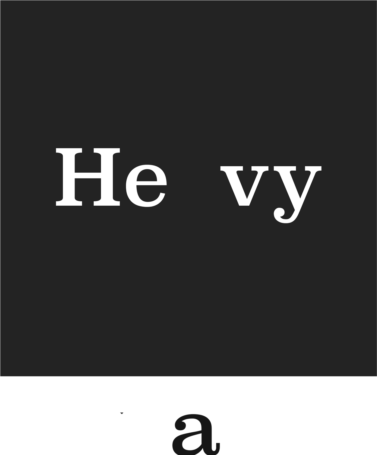
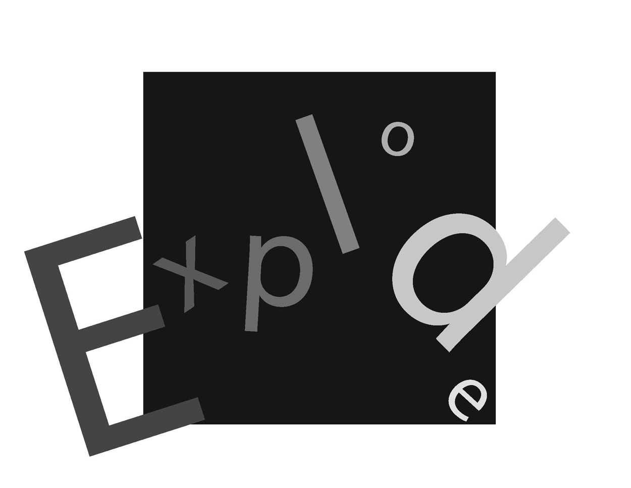
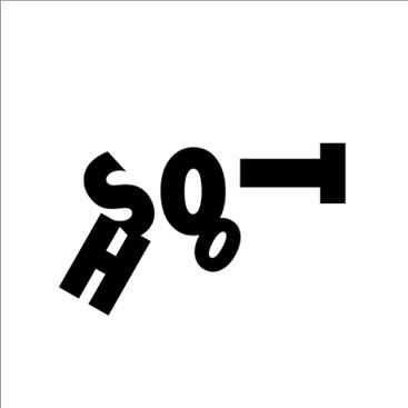
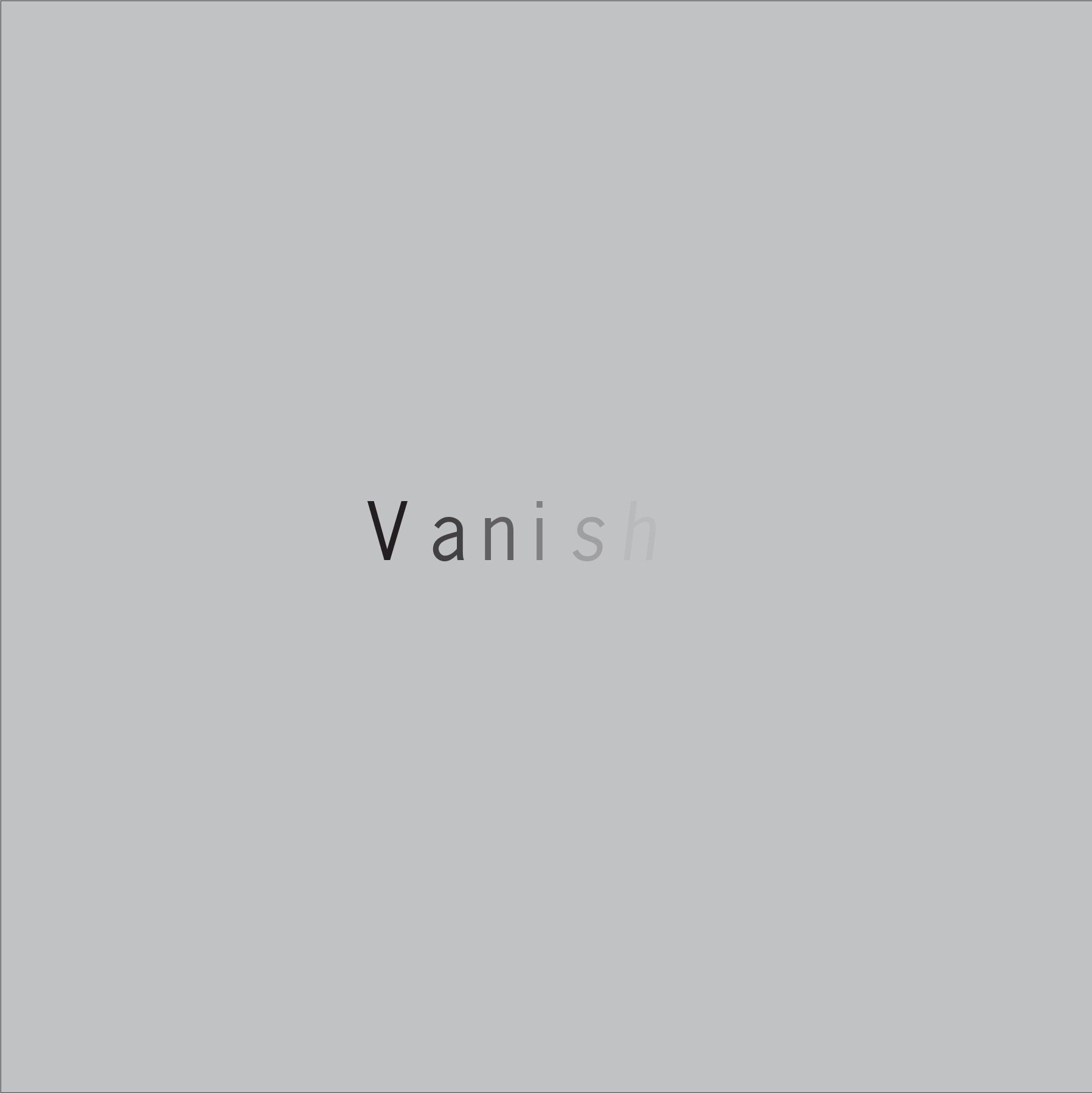
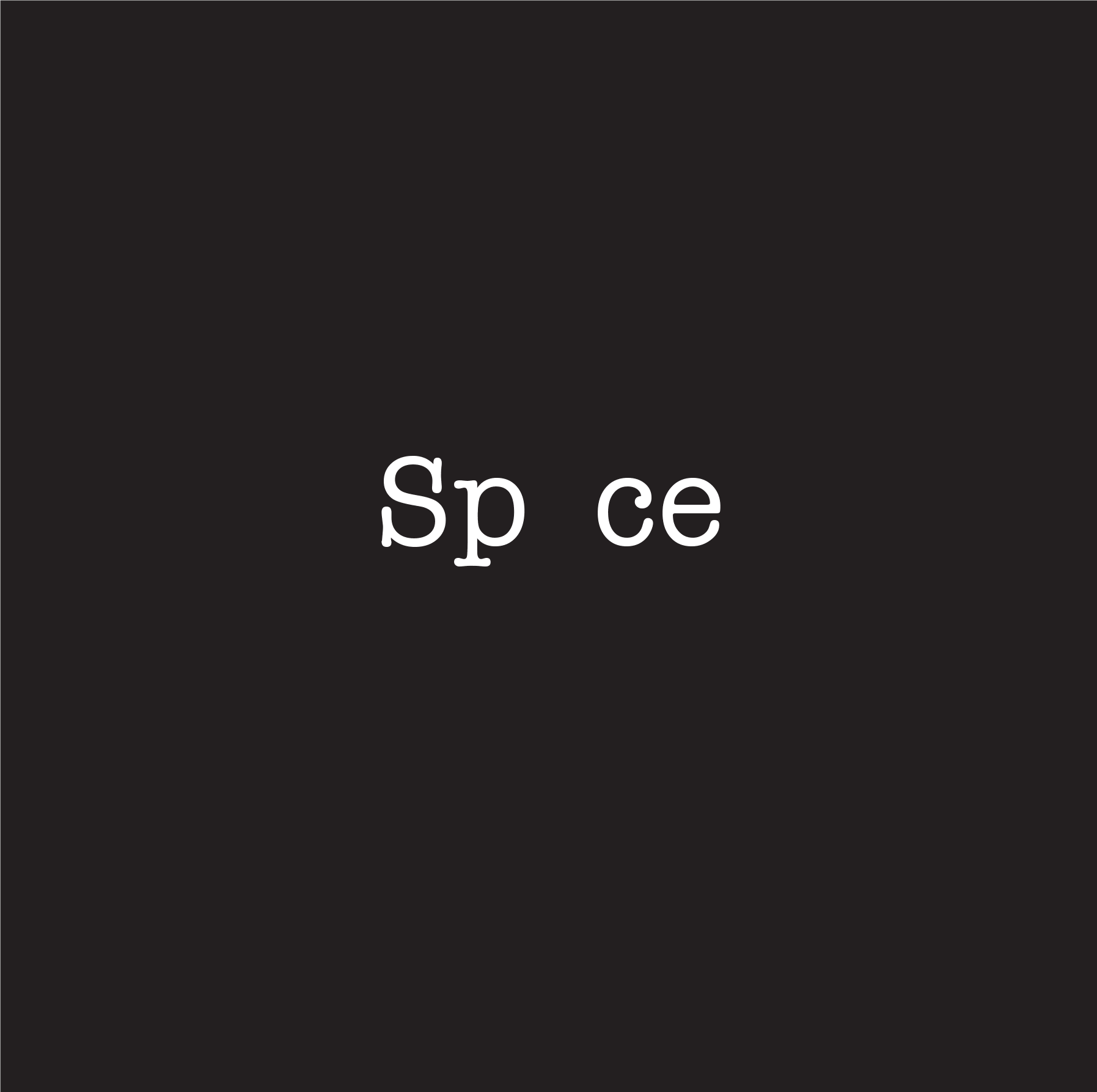
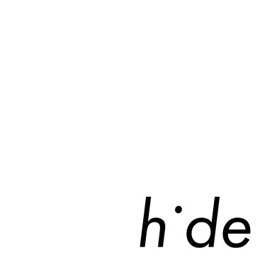
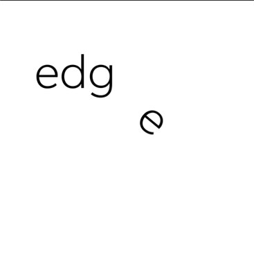
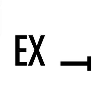
Students were asked to select a single word and visually interpret its meaning using only letterforms — manipulating type to convey tone, mood, or content through shape, form, spacing, scale, rhythm, and movement. No illustrative elements or symbols were allowed beyond the word’s own letters.
This project challenges students to think like designers and not illustrators — to use typographic nuance (weight, alignment, contrast, repetition, tension, distortion) as the expressive material of communication.
Goals
-
Introduce the basic language and anatomy of letterforms
-
Explore the interaction between form and meaning
-
Develop awareness of typography as emotive and structural material
-
Encourage experimentation with visual hierarchy, abstraction, and spatial relationships
Historical Context
This project also opens space for historical discussion:
-
Where do our letterforms come from?
-
How have alphabets evolved over time?
-
What is the relationship between the visual and the verbal?
As students manipulate the shapes of familiar letters, they begin to question their origin. We often begin our typographic lives not by reading, but by making marks — scribbles on walls, shapes in sand, symbols carved into surfaces. These early gestures mirror the emergence of the alphabet itself, which evolved from pictographic and symbolic systems into codified scripts.
For example, the letter A can be traced back to an Egyptian hieroglyph representing an ox head, which transformed over centuries through Semitic, Phoenician, Greek, and Roman scripts. What began as a symbol evolved into a sound, a system, and eventually, a design language.
Understanding this lineage reinforces the expressive power of type — and its deep cultural significance.
Broader Design Implications
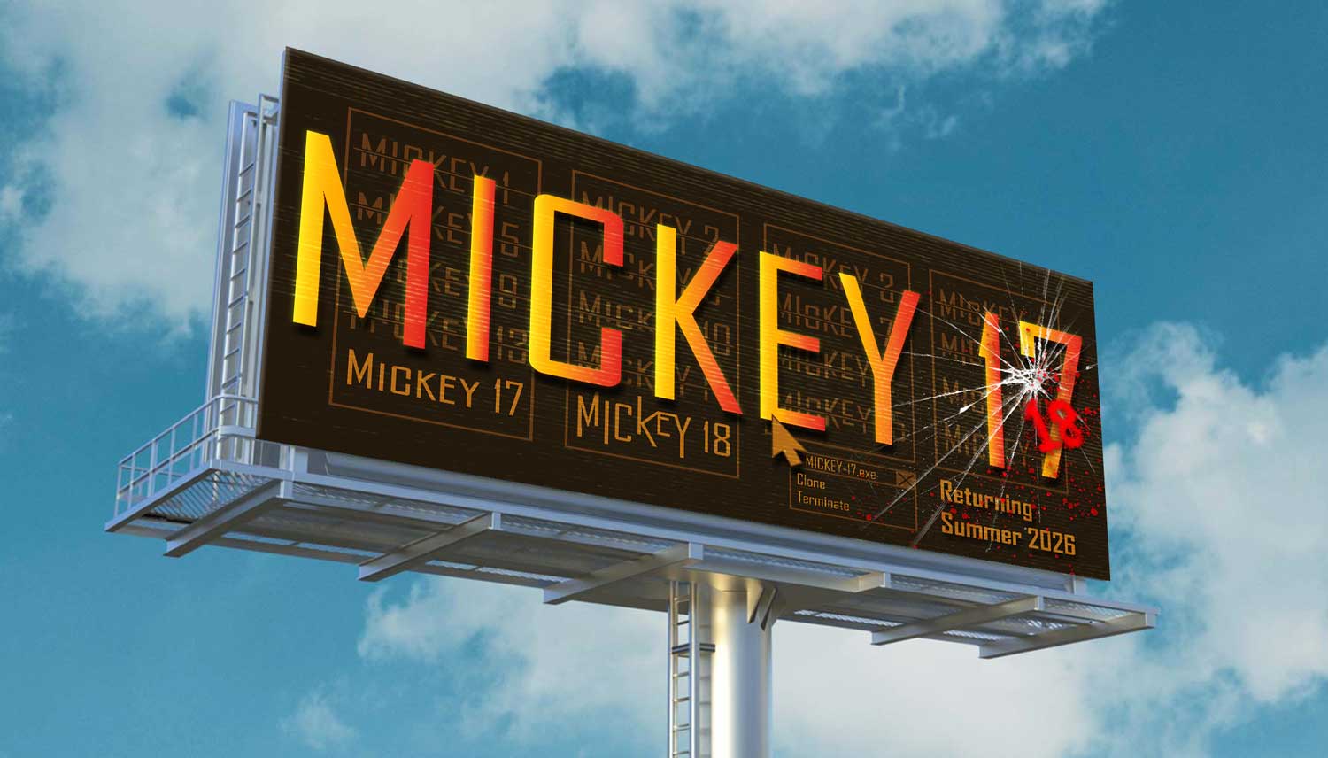
This assignment also parallels professional challenges faced in branding and identity design, where designers must give visual shape to the tone of a word or name. This project also expands to variations including the use of scientist names, animating the word, while giving an introduction to Adobe After Effects, and one-to-two-word billboard designs. All of this invites students to begin considering:
-
How visual form enhances or transforms semantic meaning
-
How typography functions beyond readability — as communication through form
-
How visual identities are built from the interaction of letterforms, structure, and emotion
Outcomes
Students created digital compositions in black and white (or limited color) and participated in guided critiques focused on:
-
Conceptual clarity and typographic decision-making
-
Form exploration, hierarchy, and spatial use
-
Consistency between word meaning and visual treatment
This assignment is often repeated at higher levels in increasingly sophisticated ways — but the first encounter is always revealing. It asks students to take their first steps from reading words… to seeing them.
Palika Sridurongrit, Fall 2024, George Mason University
Jenny Peng, Spring 2025, George Mason University
Jordan Edwards, Spring 2025, George Mason University
Erica Krahn, Fall 2021, Univ. Minn. Duluth
University of Minnesota — Duluth
Sophia Winsand, Fall 2021, Univ. Minn. Duluth
Linda Pham, Spring 2025, George Mason University
Victor Albertson, Fall 2025, George Mason University
Kera Parham, Spring 2025, George Mason University
Eunice Chang, Spring 2025, George Mason University
Eunice Chang, Spring 2025, George Mason University
Eunice Chang, Spring 2025, George Mason University
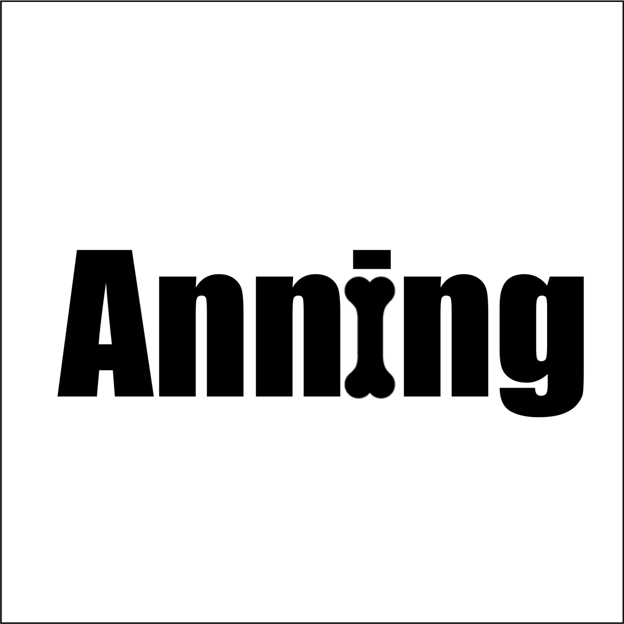
November Jones, Fall 2025, George Mason University. Mary Anning was a fossil collector, dealer, and paleontologist.
Jonathan Mullins, Fall 2025, George Mason University
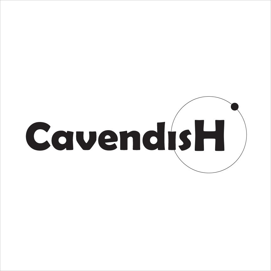
Alexie Lewis, Fall 2025, George Mason University. Henry Cavendish is noted for his discovery of hydrogen, which he termed “inflammable air”.
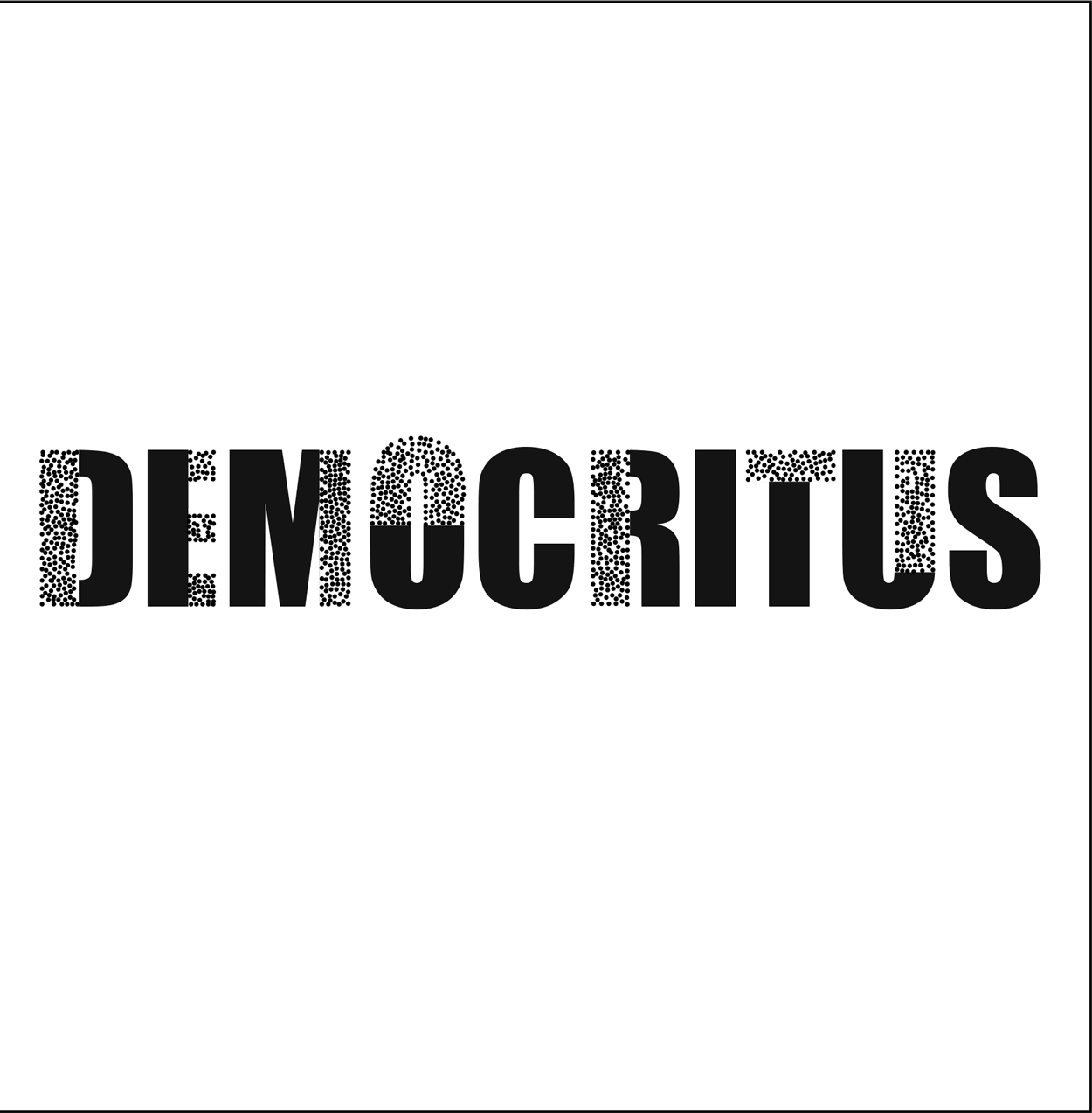
November Jones, Fall 2025, George Mason University. Democritus was an Greek philosopher best known for developing an atomic theory of the universe. He proposed that everything is composed of tiny, indivisible particles called atomos and empty space, or the void.
Hannah Diehl, Fall 2025, George Mason University
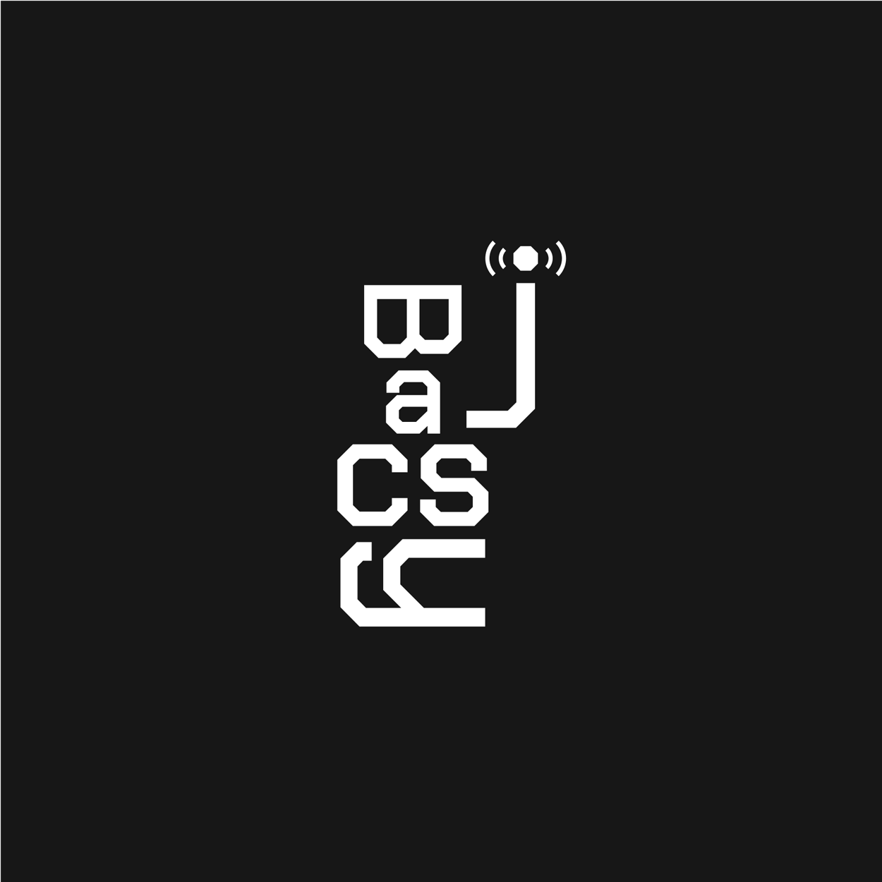
Loanie Lam, Fall 2025, George Mason University, Ruzena Bajcsy helped create robots that could sense and respond to their environment. Bajcsy believes the sensors will be “the next revolution in technology.”
Palika Sridurongrit, Fall 2024, George Mason University
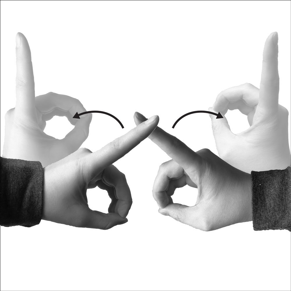
Sign language indicating the word, ‘different’. Spring 2022, The University of Minnesota — Duluth
Adonojai Dalmida, Spring 2025, George Mason University
Caitlin Kelly, Spring 2025, George Mason University
Grace Burski, Univ. Minn. Duluth, Fall 2022
University of Minnesota, Duluth
Casey Johnson, Univ. Minn. Duluth, Fall 2022
Alaina Steele, Fall 2022, University of Minnesota — Duluth
University of Minnesota, Duluth
Sara Roof, Fall 2021, Univ. Minn. Duluth
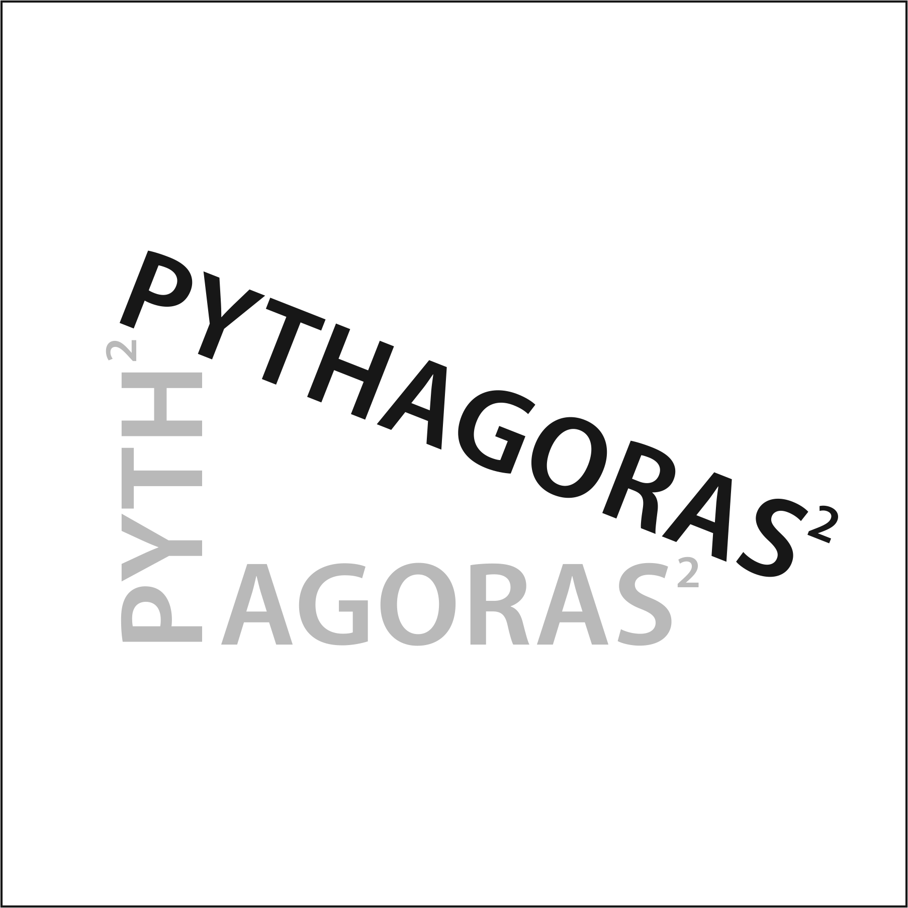
Loanie Lam, Fall 2025, George Mason University, Pythagoras was a Greek philosopher and most famous for the Pythagorean theorem, which states that in a right-angled triangle the square of the hypotenuse is equal to the sum of the squares of the two other sides.
Ian Johnston, Fall 2021, University of Minnesota, Duluth
Ryan Weeks, Fall 2025, George Mason University.

Jonathan Mullins, Fall 2025, George Mason University
Jonathan Mullins, Fall 2025, George Mason University
Imani Anzaya, Spring 2025, George Mason University
William Higgins, 2020
Montserrat College of Art
Jesse Pennington, Fall 2022, University of Minnesota, Duluth
Jesse Pennington, Fall 2022, University of Minnesota, Duluth
Melissa Connors, 2020
Montserrat College of Art
Melissa Connors, 2020
Montserrat College of Art
Nathaniel Cioffi, 2020
Montserrat College of Art
Binglei Ni, Fall 2025, George Mason University
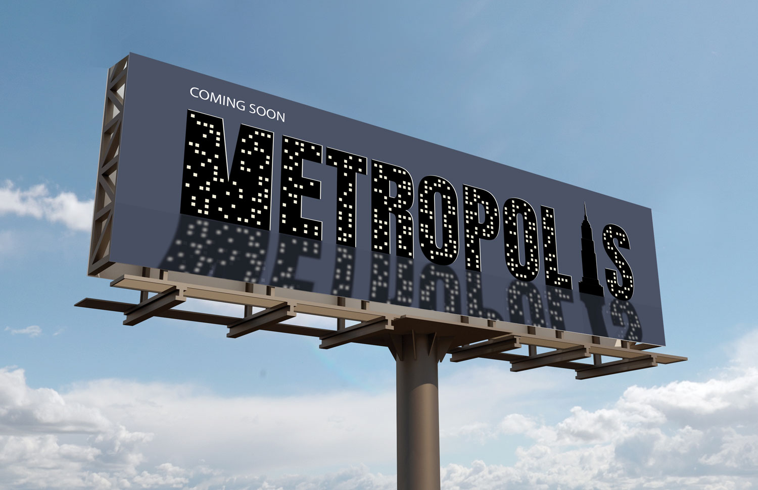
Expressive word assignment expanded to billboard design for movie release
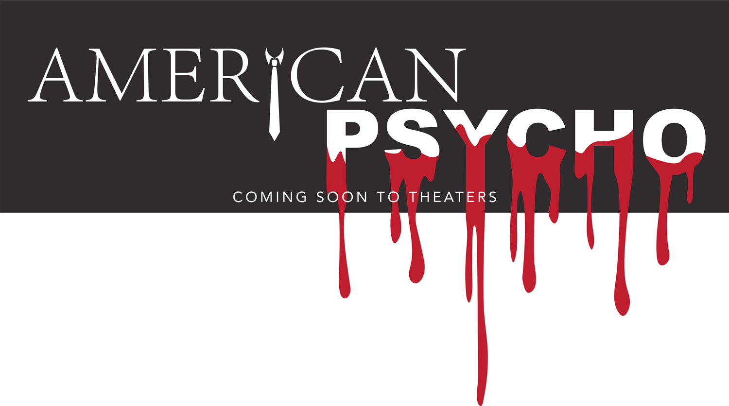
Expressive word assignment expanded to billboard design for movie release

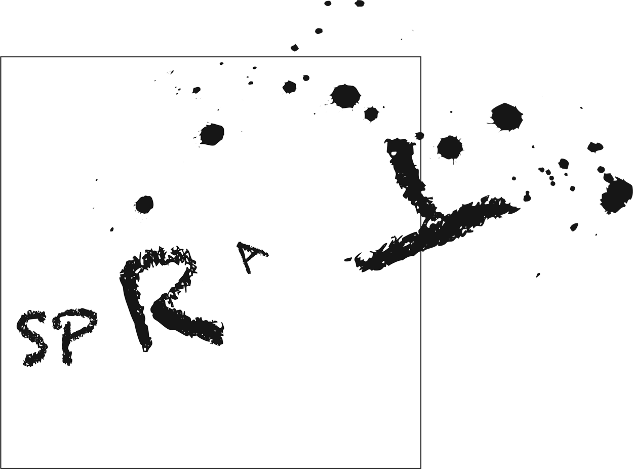
William Caldwell, Fall 2025, George Mason University