
A Blueprint for Brockton, MA — Branding and Publication for Urban Revitalization Project
![]()
A Blueprint for Brockton
Graphic representation of landmark buildings plus graphics representing historical significance of Brockton, MA.

Website Header Design

Studio D
Audio recording studio. LED lights found on audio equipment form the letter D.

Brochures Series

Education for Employment
School to work program for the Public School District of Philadelphia. Two e’s are imposed on each other, one serif, one sans-serif, one “e” for education, one “e” for employment — the combination of the 2 creates a formal mark and a significance of education and its effect on employment.

Edifice Rex Construction
Construction and renovation company.


Fall River Downtown and Waterfront
Branding executed for the Downtown and Waterfront Urban Renewal Plan for Fall River, Massachusetts. The renewal project plan itself was done by Harriman for the Fall River Redevelopment Authority (FRRA). Branding involved applications for all collateral and the graphic elements were taken and translated from familiar landmarks.
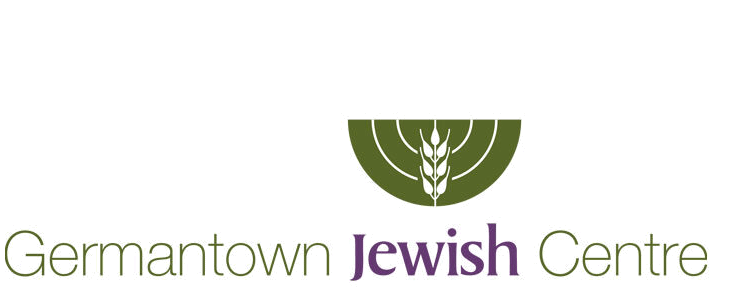
Germantown Jewish Centre
Logo is an abstract representation of a menorah with a wheat symbol, one of the seven agricultural species Scripture describes with which the land of Israel was blessed. There was also a small wheat field growing in back of the main synagogue.
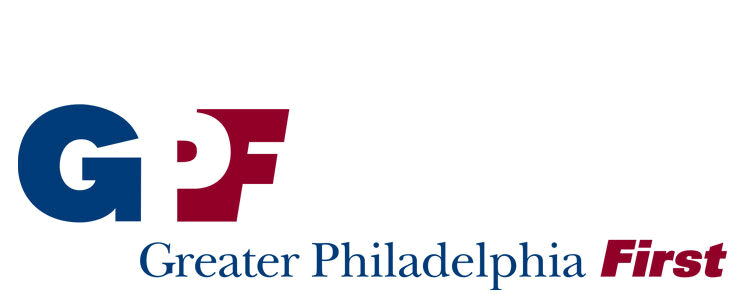

Greater Philadelphia First Announcement
Greater Philadelphia First
There was concern from the client that the logo and the use of the letterforms G P F would offer too much emphasis on the letter P, thereby promoting this civic organization as a Center City Philadelphia entity and not a greater metropolitan organization. By using the letters G and F to create a reversed out letter P form, there gave more weight to the word, “Greater”. This helped represent businesses in the Greater Philadelphia Metropolitan area and not only the immediate downtown. You can also see a circular arrow as the letter G and see how it points to the letter P for Philadelphia and even the upper left corner of the F for First.

Website Design
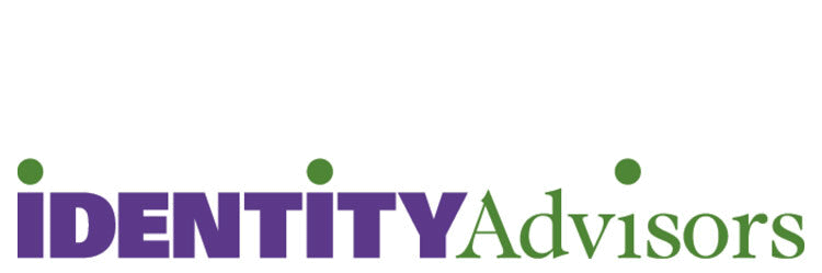
Identity Advisors
Branding, visual identities, and communication consultants. The simple dot of the lowercase i gives the needed visual language for this company.
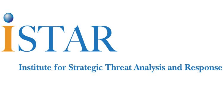

Institute for Strategic Threat Analysis and Response Web Graphics
Institute for Strategic Threat Analysis and Response
ISTAR is a non-profit organization affiliated with the University of Pennsylvania dedicated to educating the public, elected officials, and leaders from around the world on emerging threats to national and international security with an emphasis on global public health. The spherical dot of the cap “I” indicates the global reach of this organization.


Shopping Bag and Billboard
Manayunk
Less a mark and more of a visual language to represent Main Street, Manayunk, PA. Manayunk is a Native American word meaning, “where we go to drink”, and the individual letters represent the idea of food, drink, and retail available on Main Street. Manayunk is part of the metropolitan Philadelphia area.

I95 Delaware Construction Project
Symbol taken from the many construction signs that would be visible during the highway reconstruction project along interstate 95 in Delaware.

Mark Made Into a Rubber Stamp

Midwife
Kristianna Torres is a midwife. This mark was made into a rubber stamp which made for very economical reproduction and helped the tactile quality of the identity. Ms. Torres was also a huge fan of Matisse’s lithographs from which the mark was inspired.

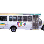
Loop Through University City- LUCY Bus Transportation Graphics
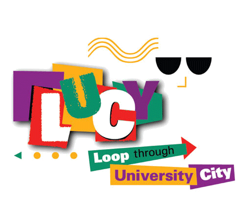

Loop Through University City- LUCY Bus Transportation Graphics
Loop Through University City — LUCY
Visual identity for shuttle bus service that transported students throughout the campus of the University of Pennsylvania in Philadelphia, PA.

Malden Commercial Corridor concept sketches
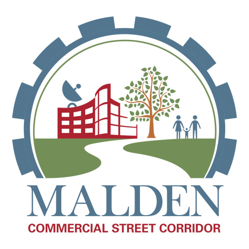
Malden Commercial Street Corridor
Branding for urban planning project. This identity was inspired from mid-century industrial graphics which the community had been industrialized over the past century and was busy redeveloping into a more residential and business friendly environment.
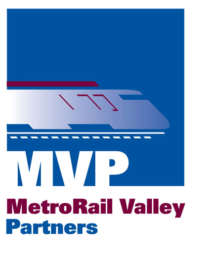
MetroRail Valley Partners
An organization that studies the feasibility of public transportation rail lines through communities. The graphic inspired from the motion of passing trains.

Website Design and Poster

Sea Scituate 2040
Planning project along the coast of Massachusetts in the town of Scituate.

Sustainability Conference at Suffolk University.

Urban Ecological Sustainability and Security Conference
A conference bringing together people from Suffolk University in Boston, MA and representatives from Singapore, China, to study and exchange ideas on urban development and sustainability. The mark is inspired from ocean waves and the yin yang symbol.
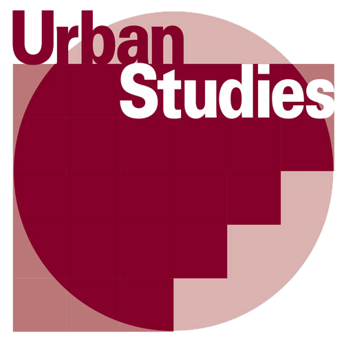
Urban Studies
Department at the University of Pennsylvania, an interdisciplinary program in the College of Arts & Sciences that offers students a multi-faceted approach to the study of urban trends.

Waltham Book Festival
Graphic representation as you would see books on a shelf.