
Typographic Joinery: Form, History, and Abstraction
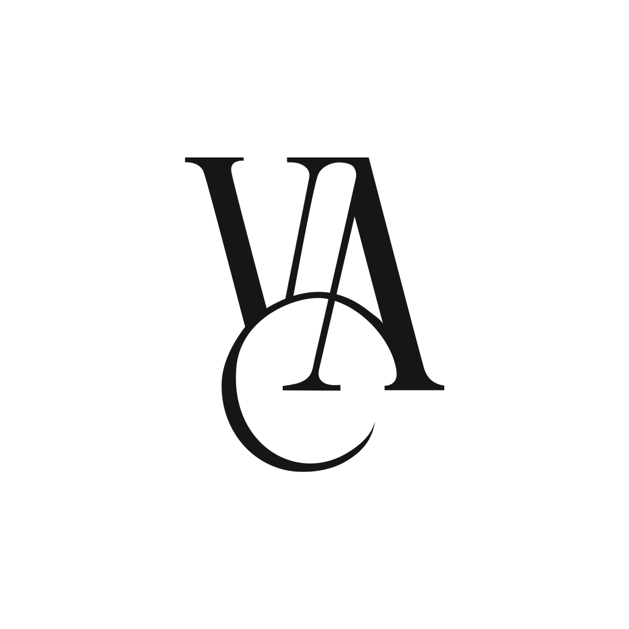
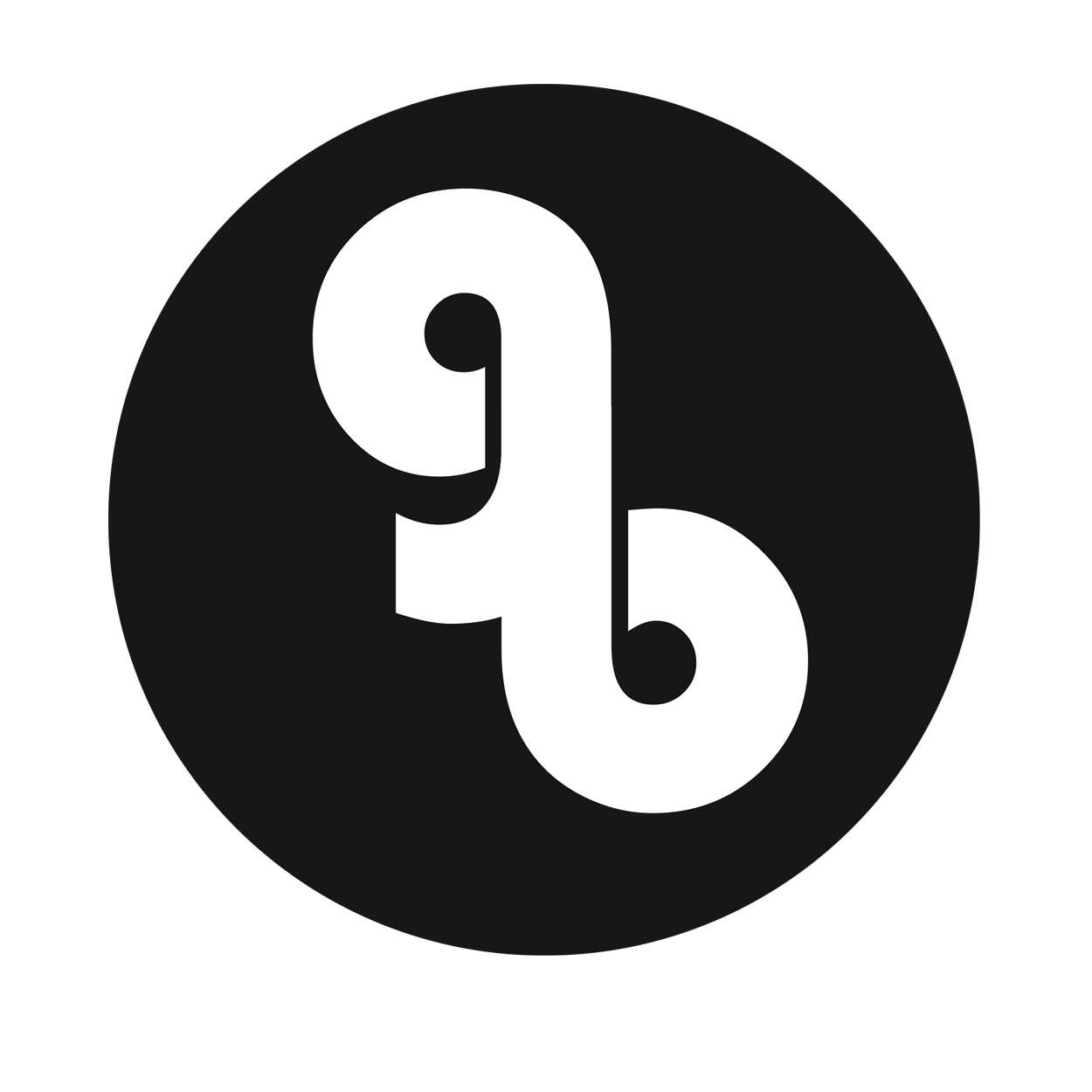
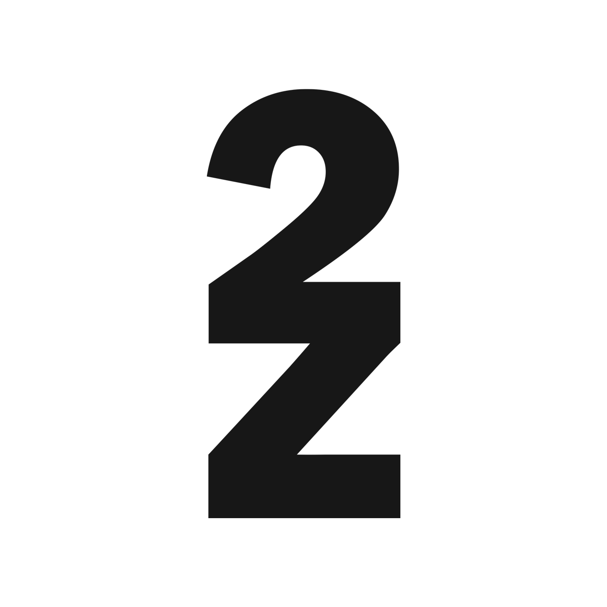
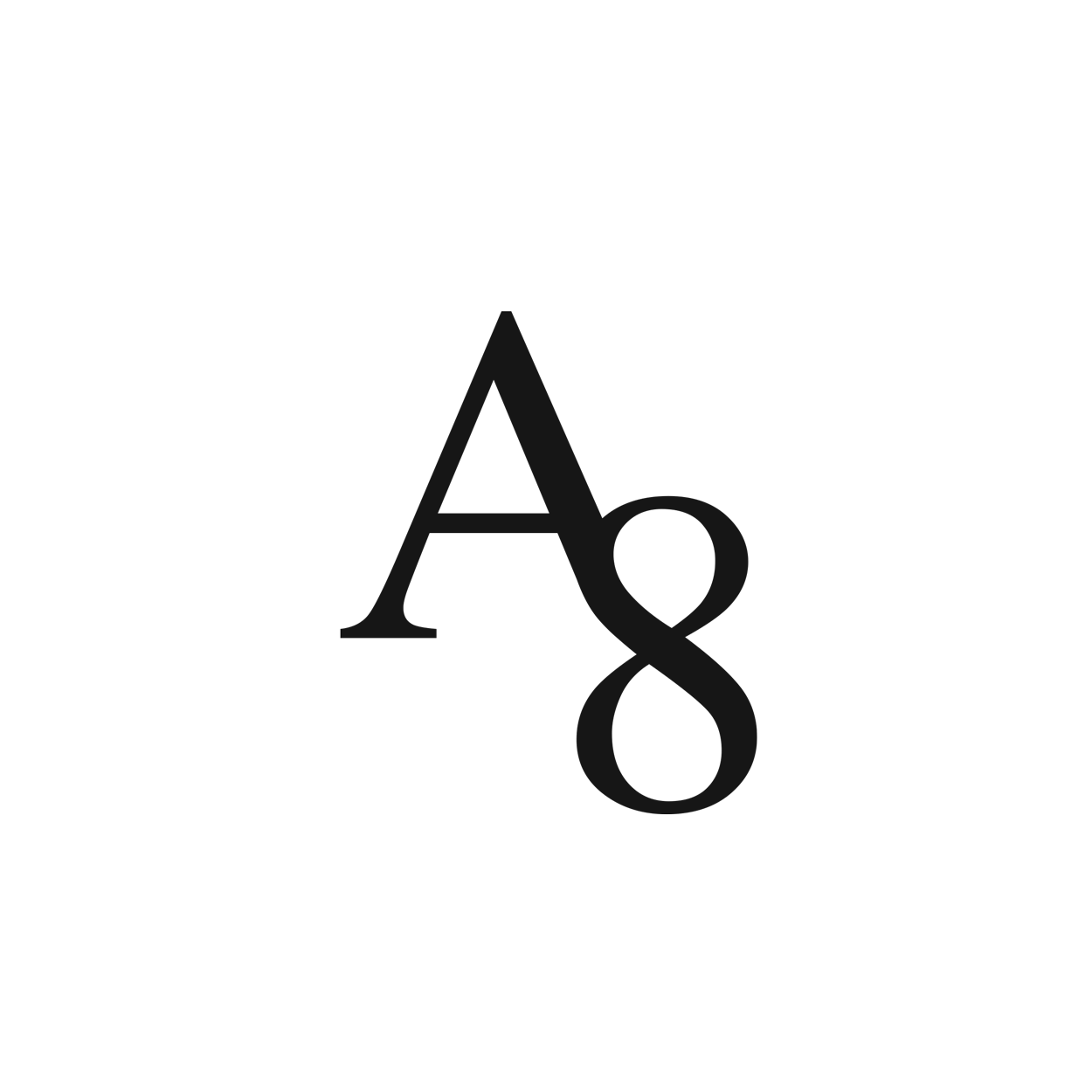
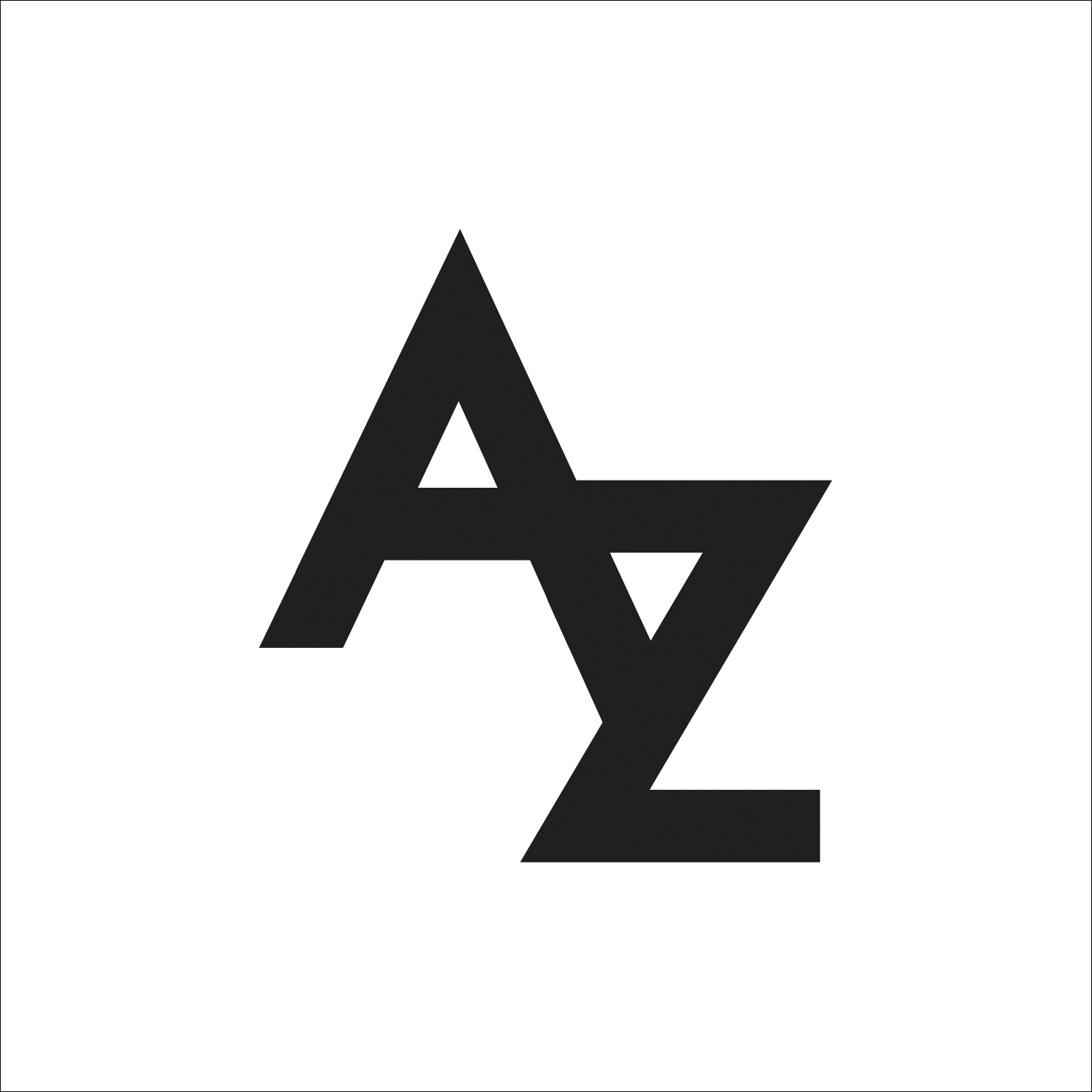
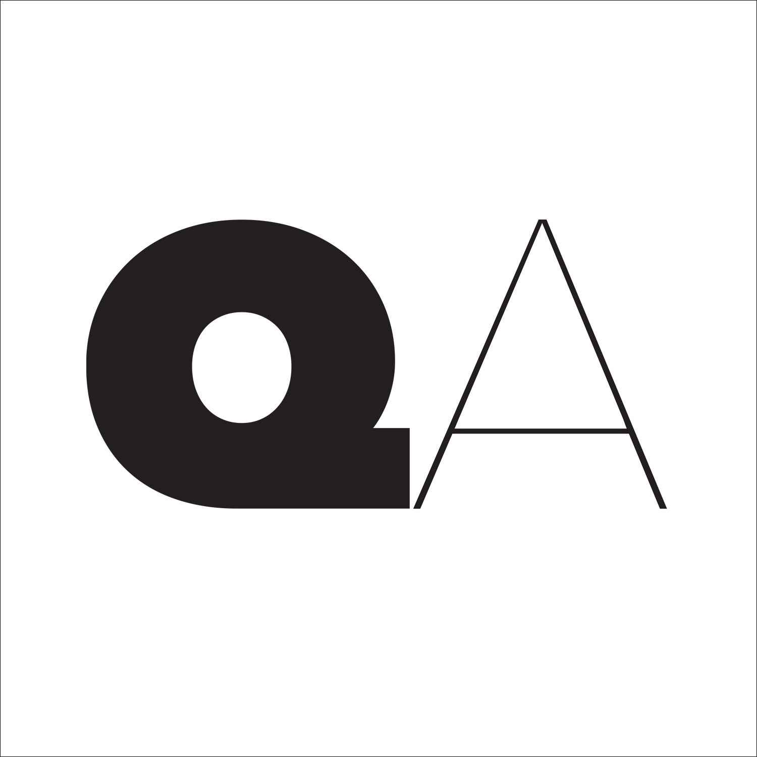
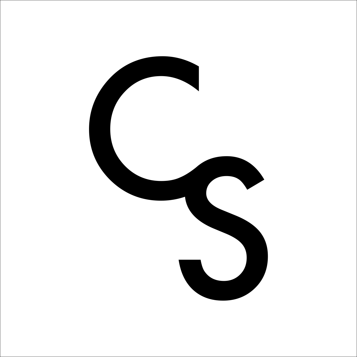
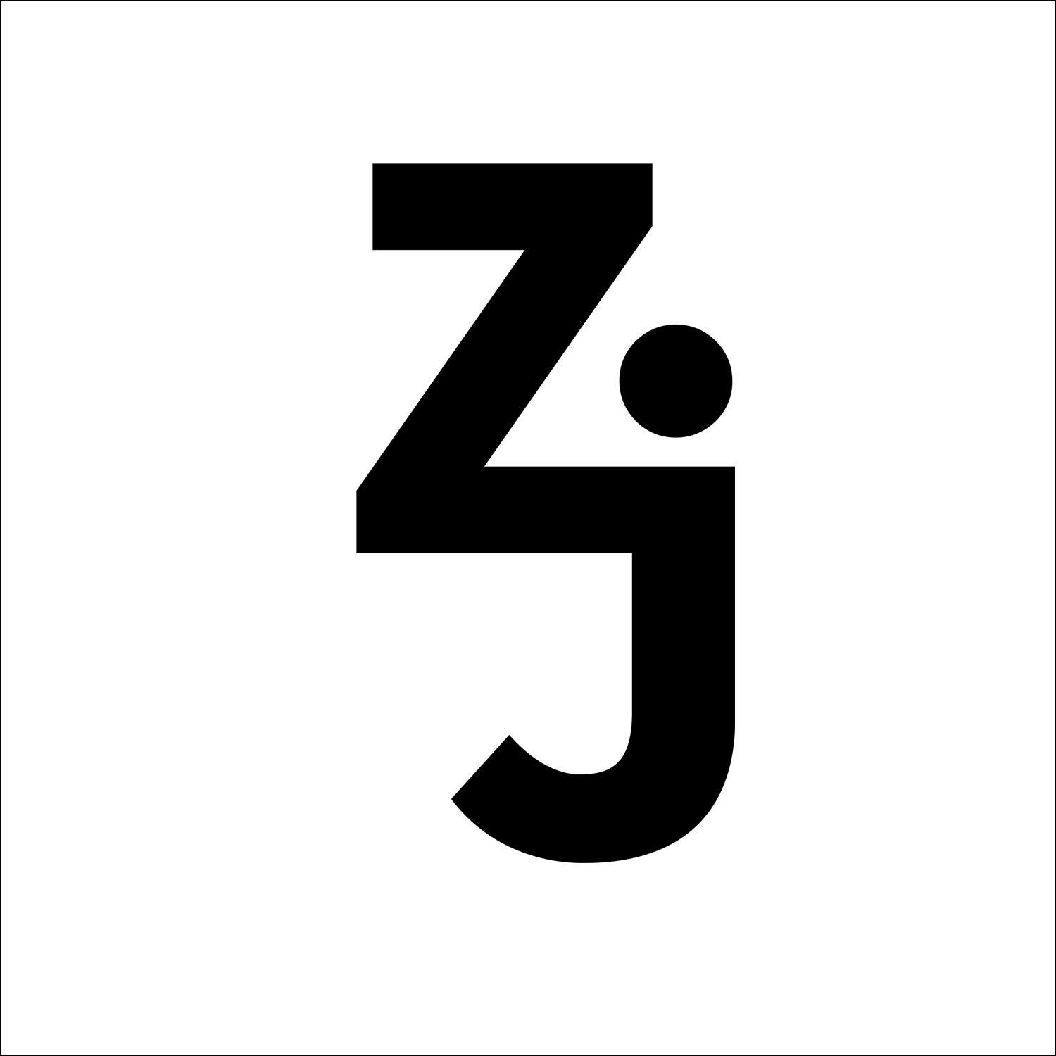
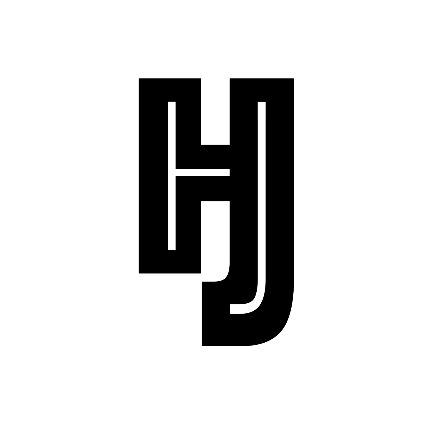
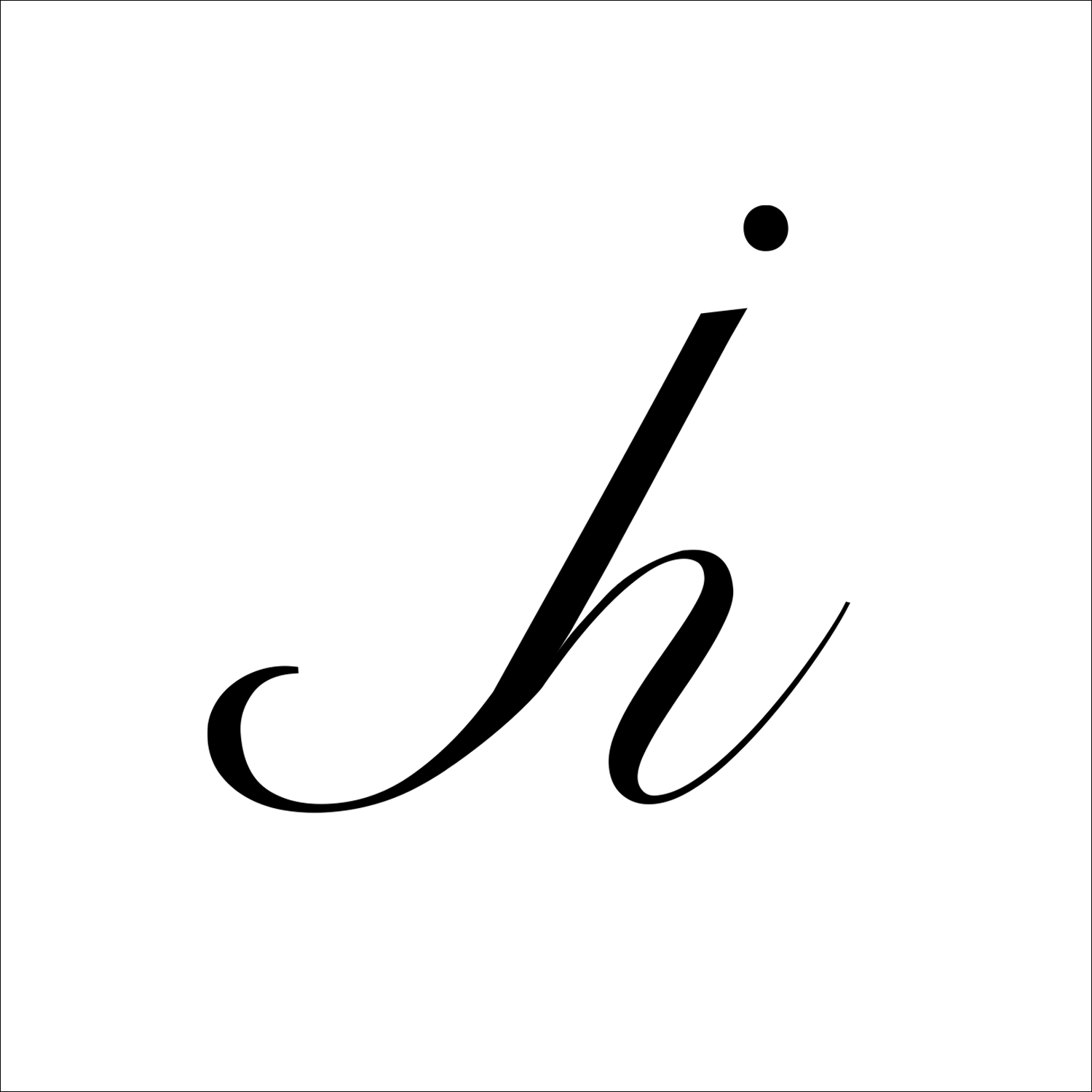
As an introductory exploration of typographic form, students were challenged to create original visual configurations by combining letterforms from the Latin alphabet. Through this typographic joinery, they investigated proportion, weight, counterform, and spatial relationships — gaining a deeper understanding of letterforms not just as carriers of content, but as compositional and symbolic forms in their own right.
The objective was to create visual gestalts — unified compositions whose meaning and form emerged from the interaction of individual parts, rather than any one letter alone.
This formal exploration opened the door to broader conversations about the history of the alphabet and the symbolic evolution of our written language.
Where do letterforms come from?
We often take type for granted, yet letterforms are deeply rooted in cultural memory and human mark-making. I encourage students to think back to the earliest gestures of communication — a child’s first scribble, an ancient cave mark, a deliberate cut into clay — and to see type not just as language, but as evidence of presence and identity.
Take the letter A, for example:
-
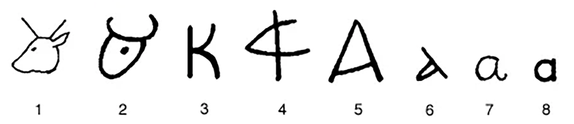
Its earliest origins trace back to an Egyptian hieroglyph of an ox head (𓃾),
-
Adopted into Semitic writing as aleph, meaning “ox”,
-
Later abstracted by Phoenicians,
-
Adapted by the Greeks into alpha,
-
And finally integrated into the Latin alphabet, evolving through handwriting and print into the forms we recognize today.
This project used the act of letterform construction as a way to connect the past and present, the formal and symbolic, and the visual and linguistic dimensions of typography.
These type of assignments also offer an opportunity to talk to students about the historical aspects of our language and the history of our alphabet. How did our letters come to be? How did the letter “A” ever develop into the form we know today? The form of the letter A is thought to derive from an earlier symbol resembling the head of an ox. One can trace the history of the Arabic letter A back to Egyptian hieroglyphic writing (1) and the symbol for the ox. This symbol gave way to early Semitic writing at about 1500 BCE on the Sinai Peninsula (2). About 1000 BCE, in Byblos and other Phoenician and Canaanite centers, the ox sign became more linear (3) and looks like another of our current letters in the English alphabet. The name of the letter A in Phoenician and the Semitic language resembles the Hebrew name aleph meaning “ox”. Upon the ascendency of Greek civilization, the Greeks used the sign for the vowel a, changing its name to alpha. The Greeks used several forms of the sign, including the ancestor of the form that we are familiar with today (4). The Romans incorporated this sign into Latin. The English, whose language was influenced from Latin, first took the shape of the small a in Greek handwriting (5) and made it similar to the present capital letter. About the 4th century CE this was given a circular shape with a slanted projection (6). This shape was the parent of both the English handwritten character (7) and the printed small a (8).
Outcomes & Reflection
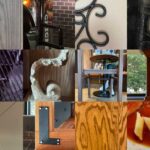
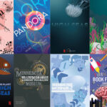
Students produced individual typographic compositions using abstracted letterforms. These became opportunities to explore:
-
Structural unity and formal experimentation
-
Gestalt principles and spatial tension
-
The transition from symbol to system
This assignment was taught across institutions and levels, and continues to evolve with each iteration.
Daniela Graur, George Mason University, Fall 2024
Daniela Graur, George Mason University, Fall 2024
Brodie Schwarz, George Mason University, 2025

Tyler Zymowski, George Mason University, 2025
Ashmia Aziz, George Mason University, 2024–2025
Amelie Garcia, George Mason University, Fall 2024

Univ. Minn. Duluth, 2021–2022

Univ. Minn. Duluth, 2021–2022

Univ. Minn. Duluth, 2021–2022
Univ. Minn. Duluth, 2021–2022
Univ. Minn. Duluth, 2021–2022
Univ. Minn. Duluth, 2021–2022
Univ. Minn. Duluth, 2021–2022
Univ. Minn. Duluth, 2021–2022
Univ. Minn. Duluth, 2021–2022

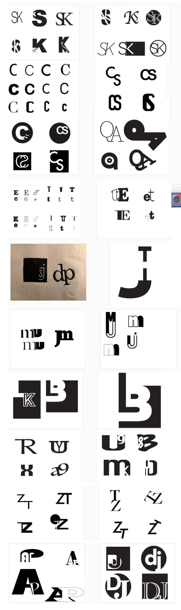
Sketches and experiments