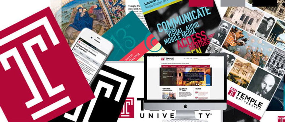
 Consultation on branding standards for Temple University. Responsibilities included getting an inventory of assets while validating well-met standards and identifying inconsistencies in applications. This project established thorough guidelines on the use of their visual identity. Researched was done within the collaboration of the administration and relative departments to get feedback with their aesthetic and workflow considerations that would affect application of the brand.
The Temple “T” was designed in 1983 by students in the graphic arts and design class in the Tyler School of Art and Architecture to celebrate the university’s 100th anniversary. Its design is intended to represent “strength and positive character, with open ends that are symbolic of the free exchange of ideas that is the hallmark of a Temple education”.
 Temple University’s history begins in 1884 as a burgeoning night school, when a young man asked Russell Conwell if he could tutor him at night. Conwell, a well-known Philadelphia minister, said yes. It wasn’t long before he was teaching several dozen students — working people who could only attend class at night but had a strong desire to make something of themselves. In 1888 he received a charter of incorporation for “The Temple College.”
Branding standards and guidelines established: Terminology, Master Logo Usage, Minimum Clear Space, Master Logo Space and Positioning, Vertical Usage, Size Requirements, Signature Usage, Acceptable and Unacceptable Uses, Master Colors, Logotype Artwork, Logotype Usage, Typography, Primary Typeface, Print and Merchandise Usage, Brochures, Certificates, Business Card, Letterhead, Envelope, Other Electronic Usage, PowerPoint Presentations, Websites, Mobile Responsive Websites, Social Media Websites, Video Standards, Editorial Messaging, and Image Samples


